Interior Design

{I N S P I R E D} Gorgeous Finds at NYCxDESIGN by Eileen Boyd

Talk about being inspired. The makers who exhibited this year during NYCxDESIGN Week—at ICFF, WantedDesign and Sight Unseen's Offsite—were innovative, fresh and a welcome dose of creative energy. While there were so many spectacular finds, I wanted to share a few that especially stood out and planted seeds for my next interior design projects. Get ready for some design magic!

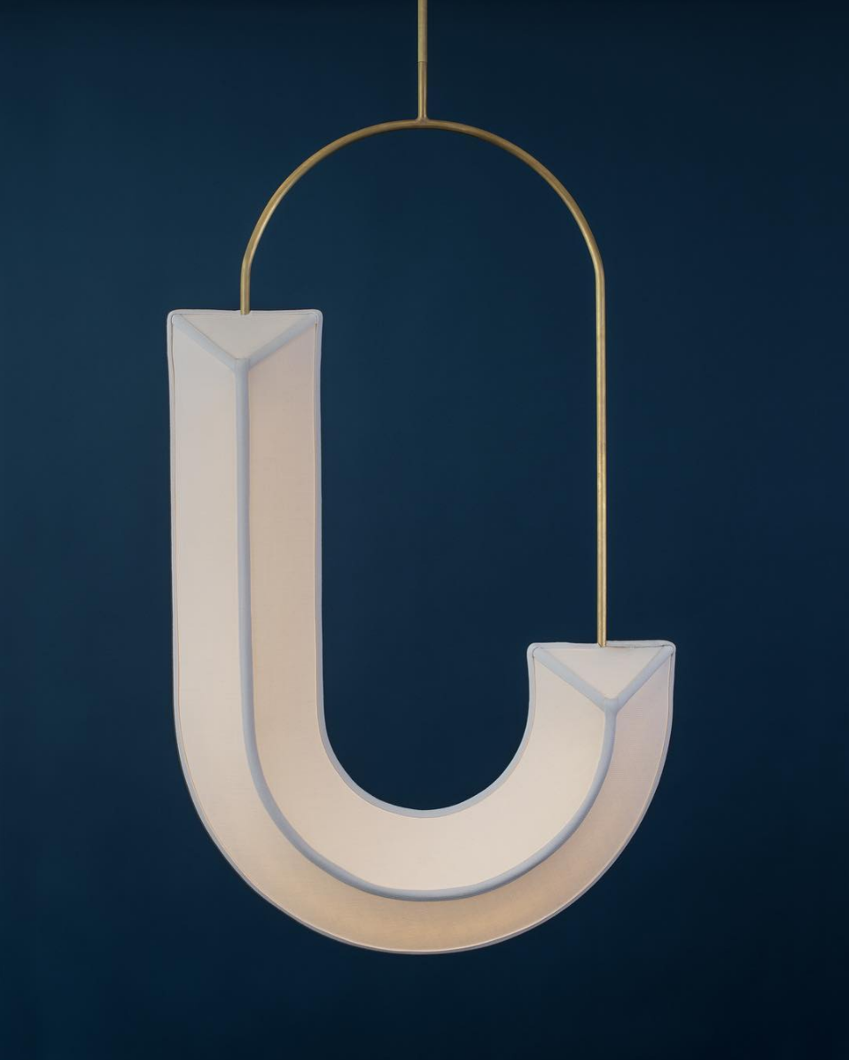
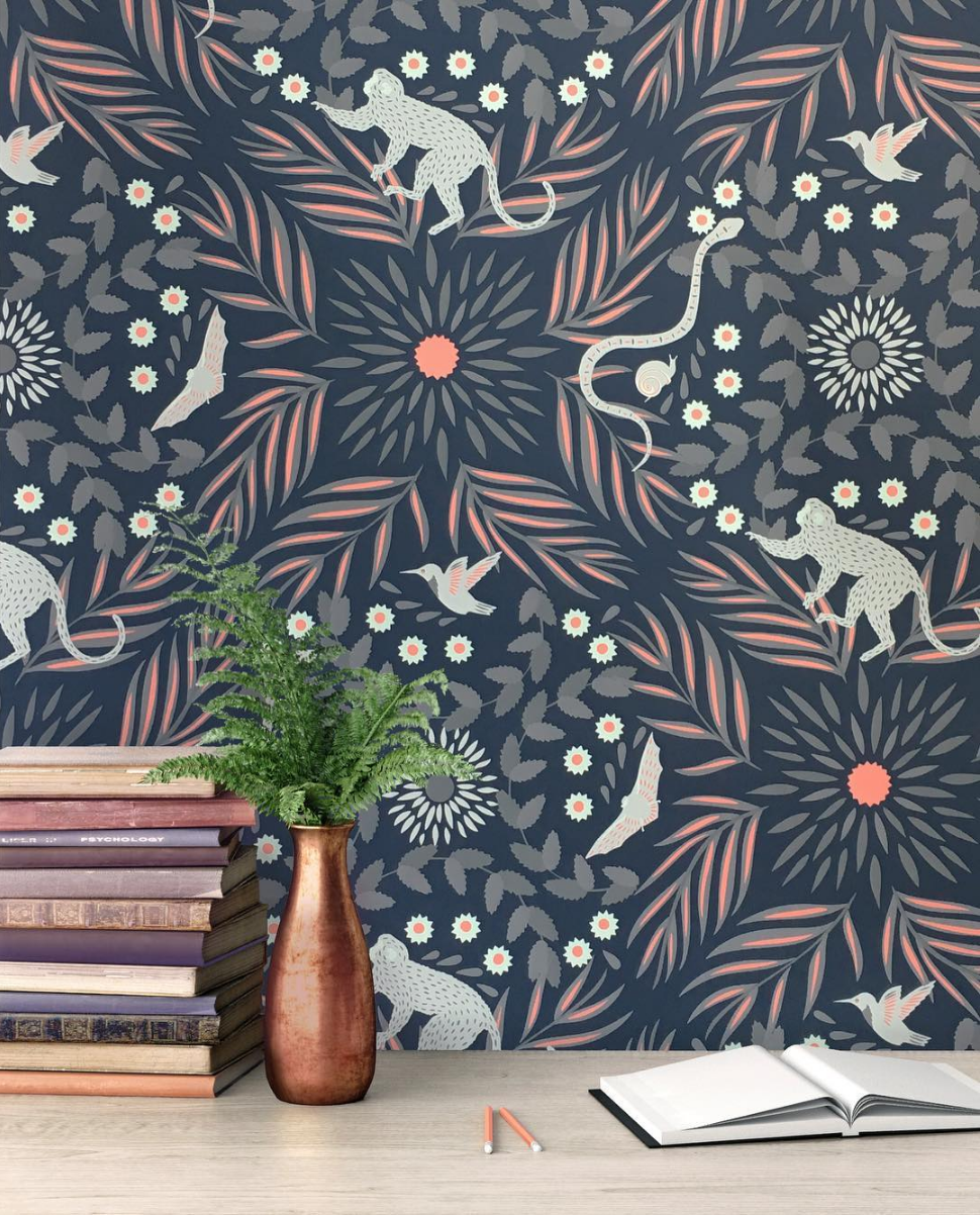
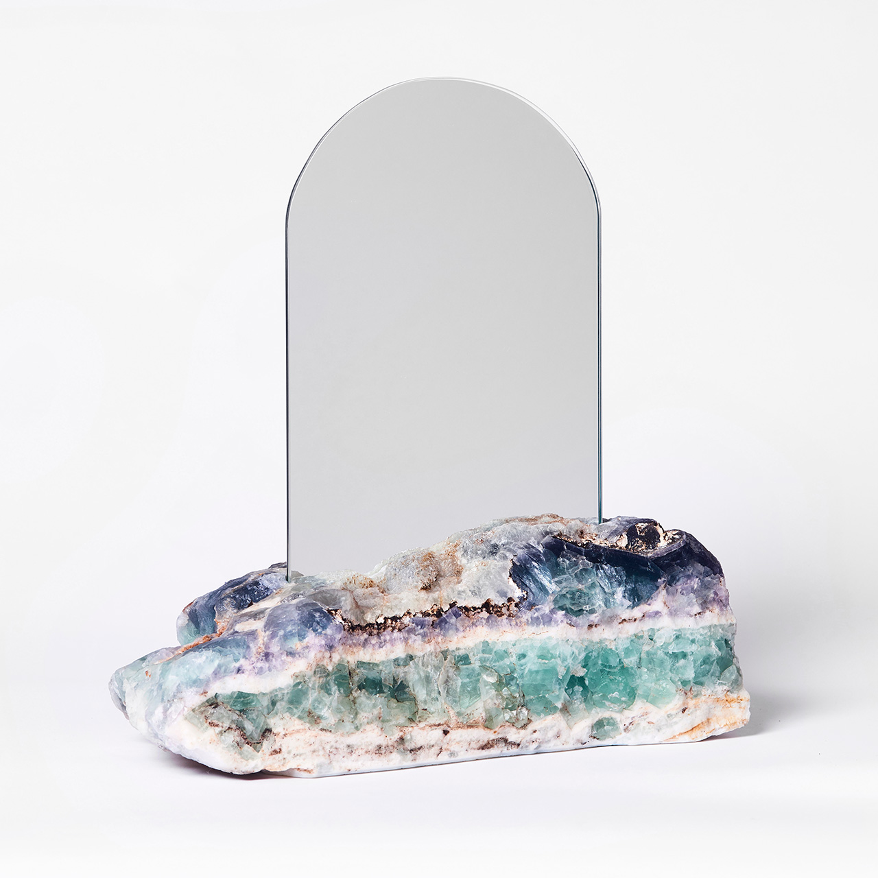
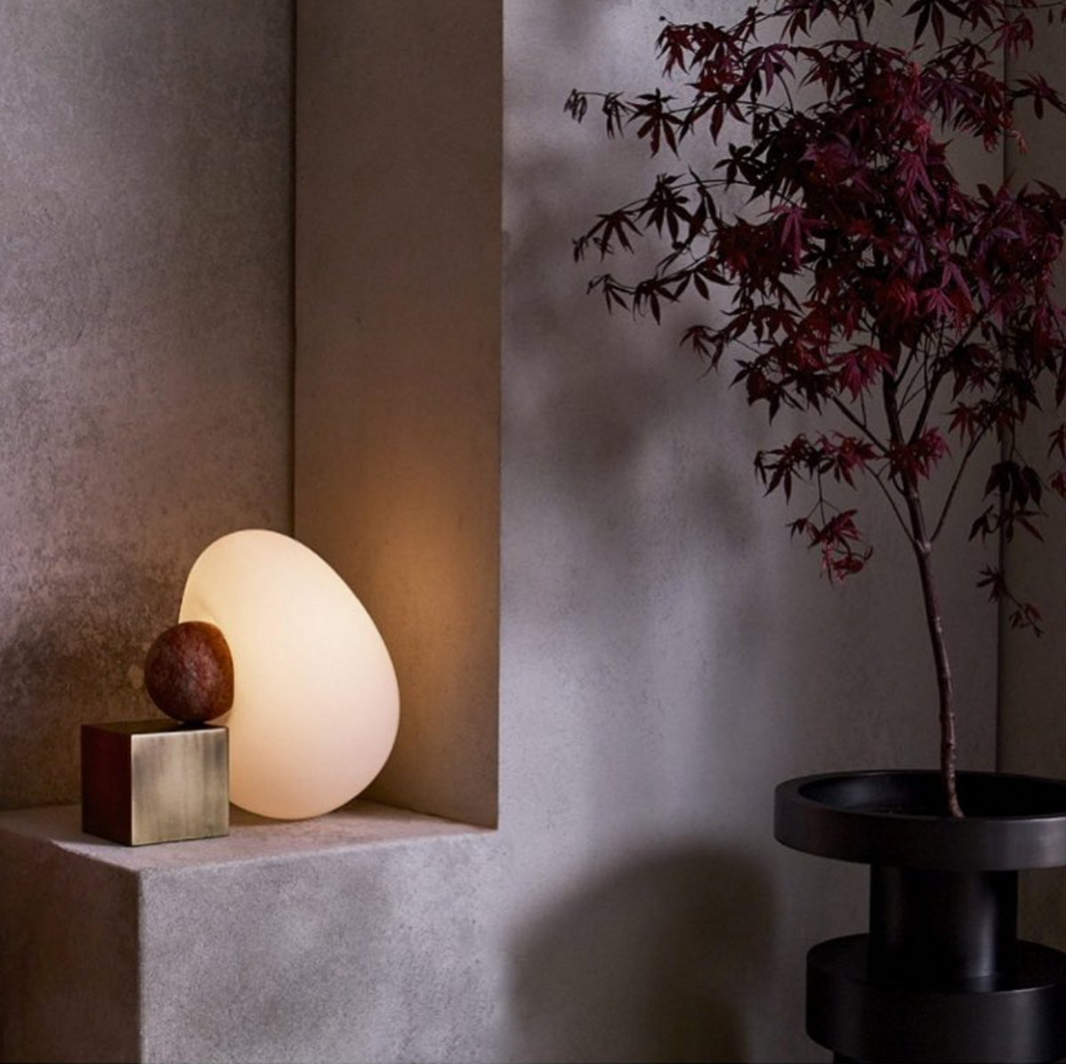
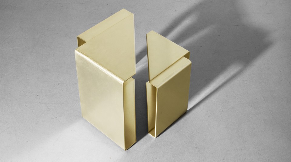
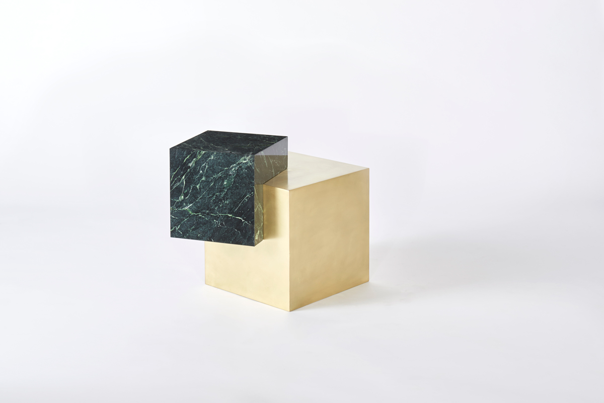
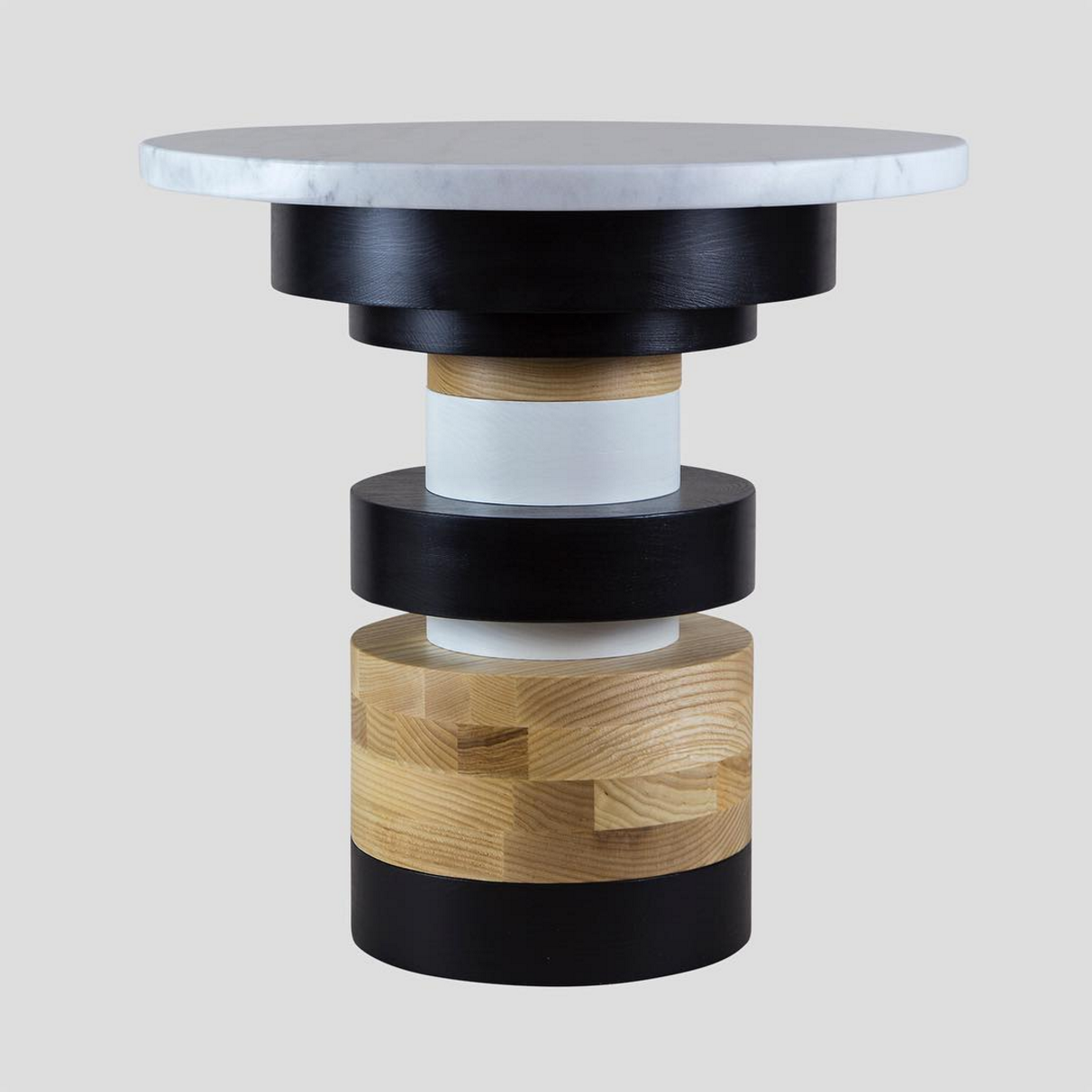
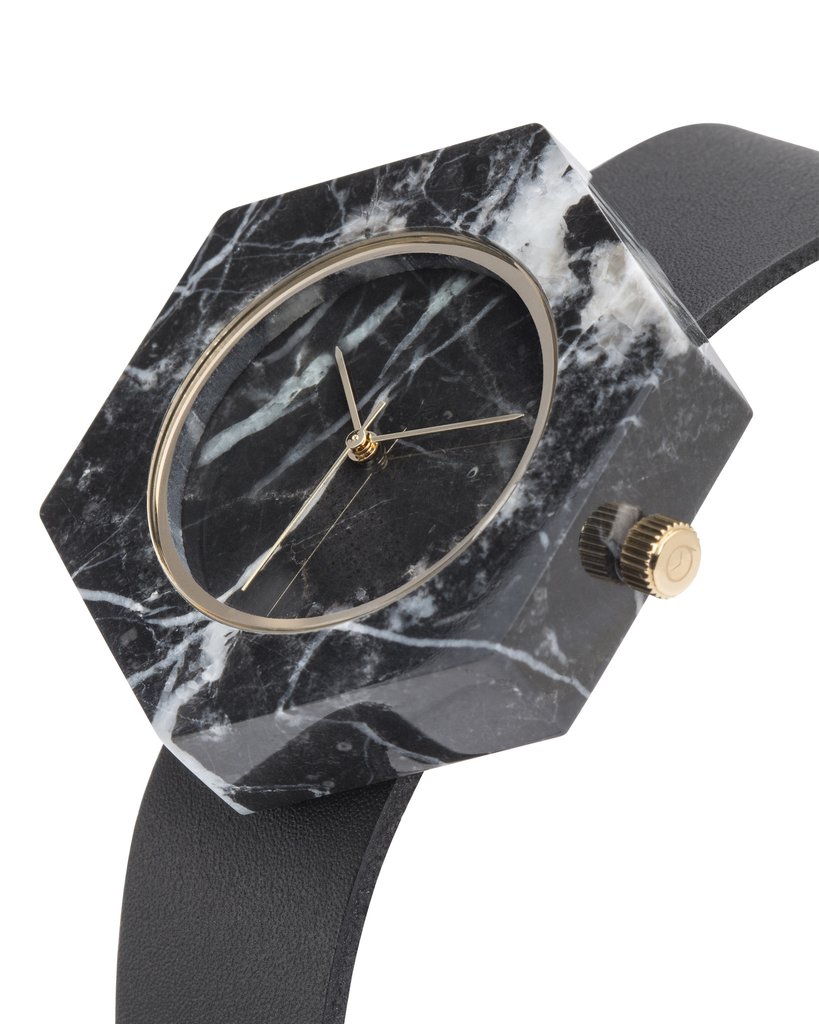
1/ Pulpites, Dear Human. 2/ Erich Ginder. Photo by Amanda Ringstad. 3/ Fauna Fantasía wallpaper in Habana, Grow House Grow. 4/ Aura Mirror in Fluorite, Another Human via Offsite. 5/ Anna Karlin. 6/ Fold Collection, Uhuru. 7/ Coexist Askew Marble and Brass Side Table, Slash Objects. 8/ Luvere Studio via WantedDesign. 9/ Sass Side Table by MPGMB for Souda Brooklyn. 10/ Black Marble Hex Mason Watch, Analog Watch Co.

{A R T} Organized Chaos by Eileen Boyd

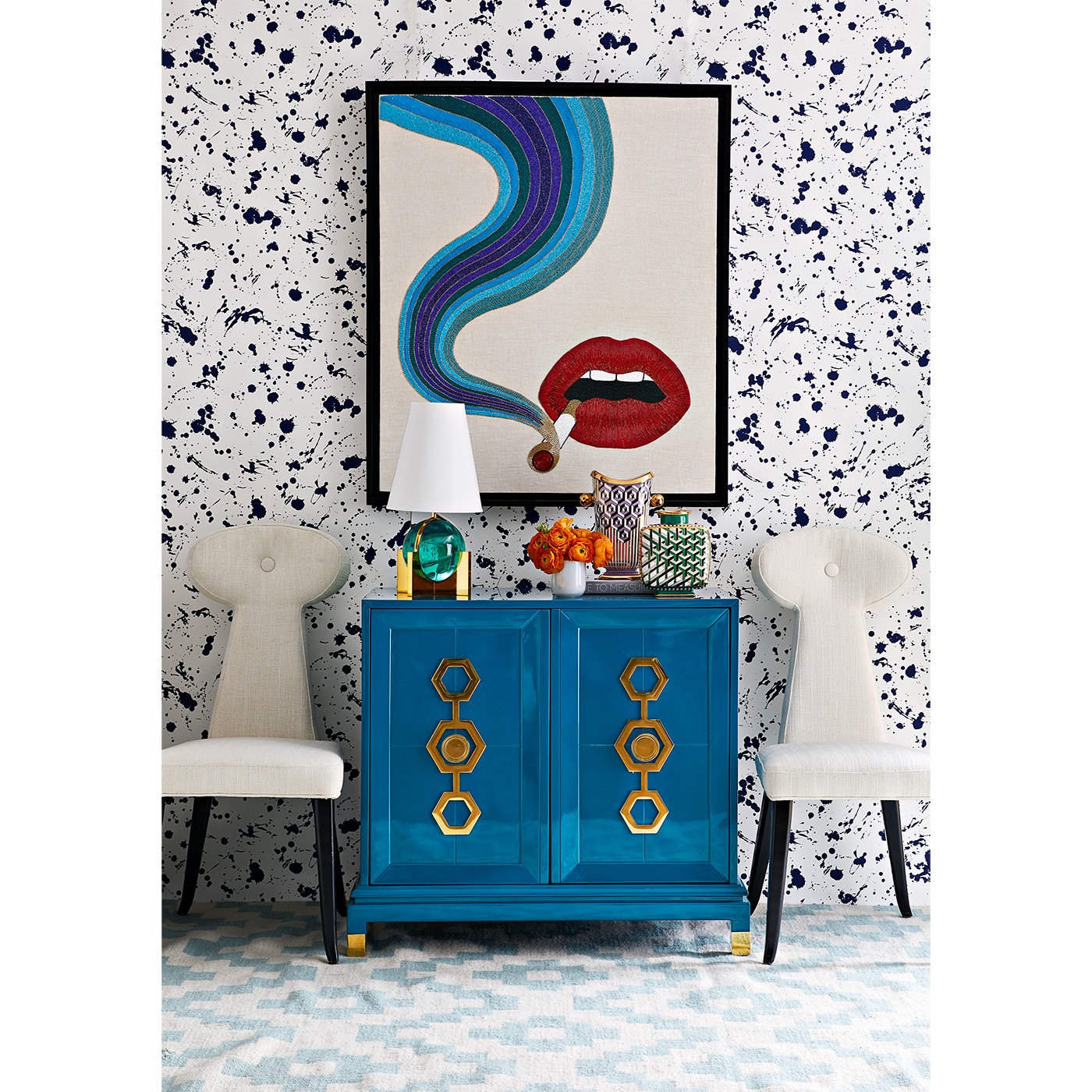
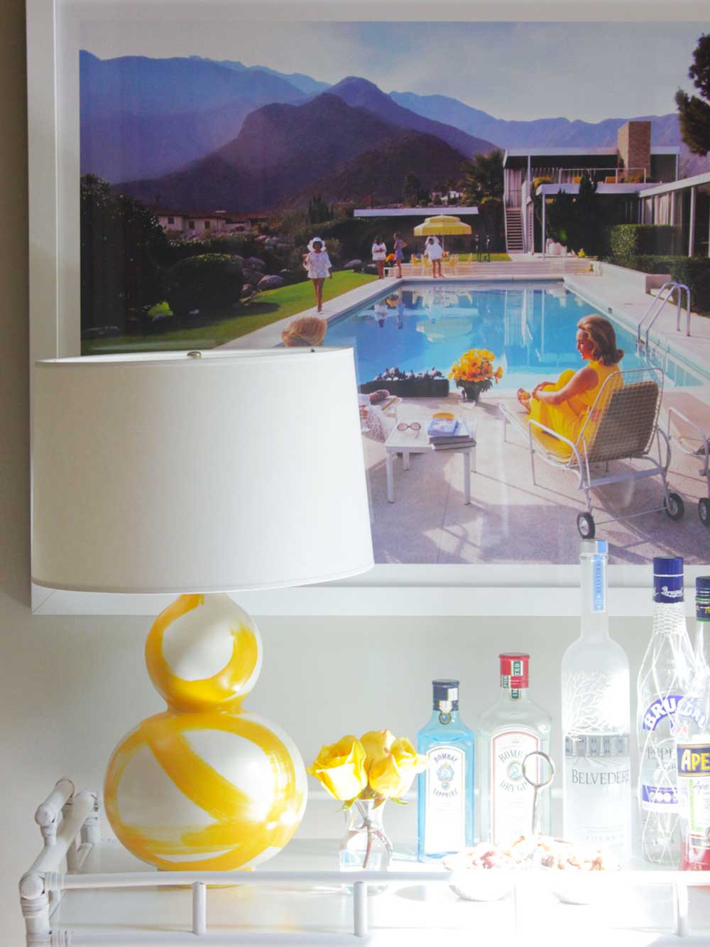
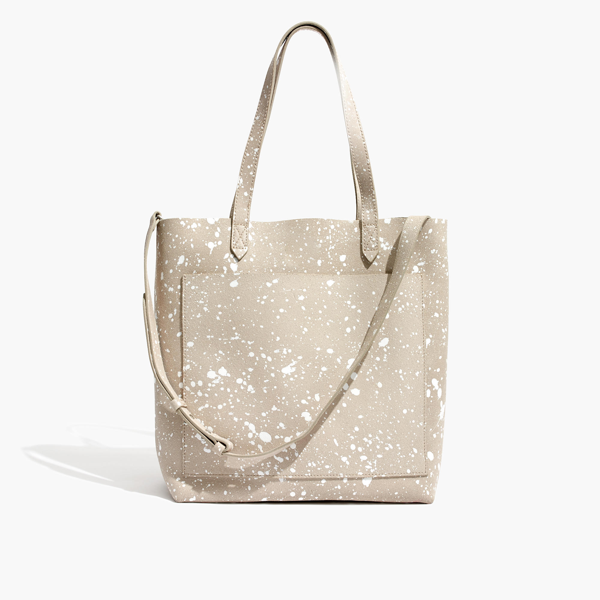
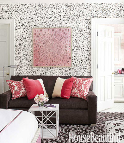
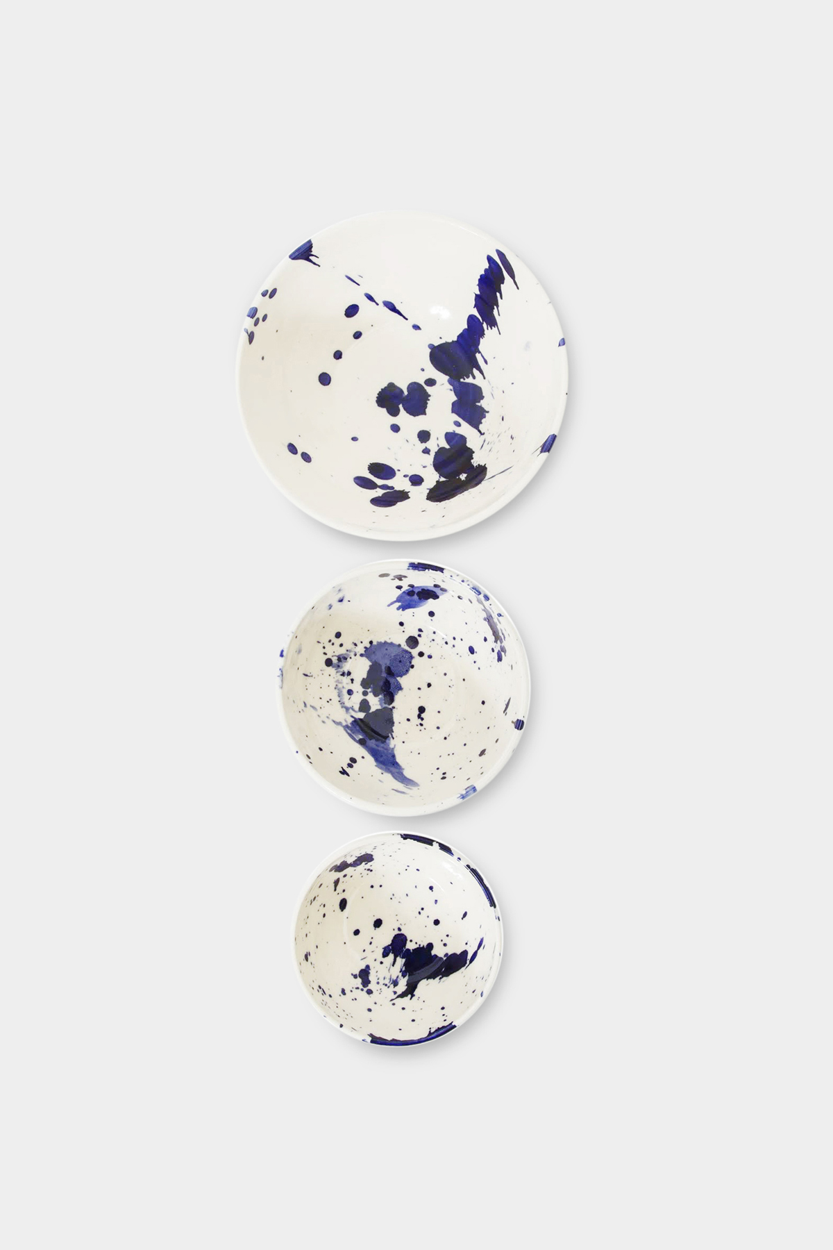
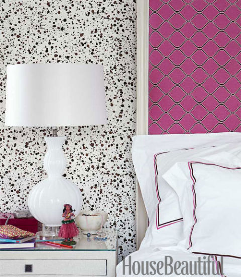
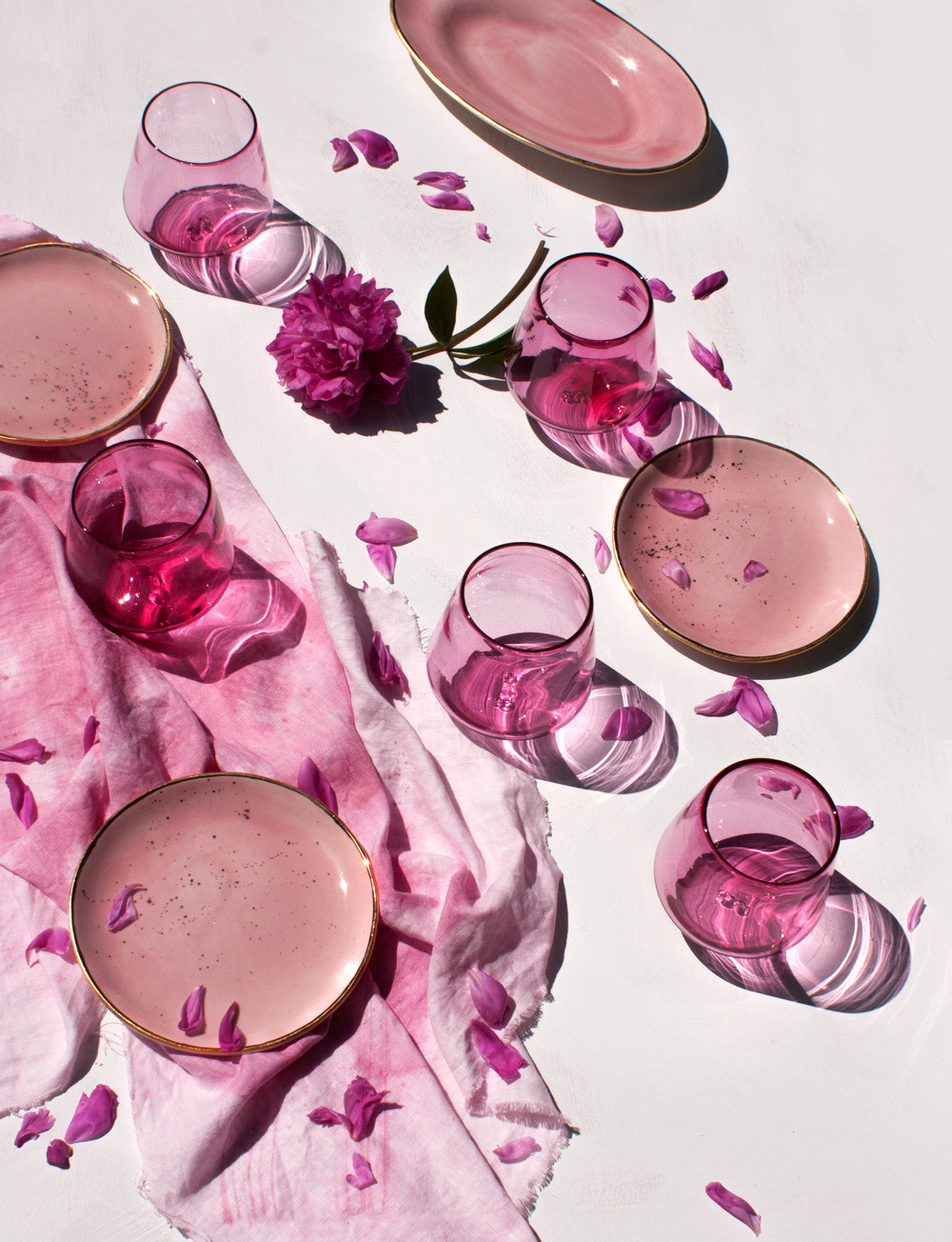
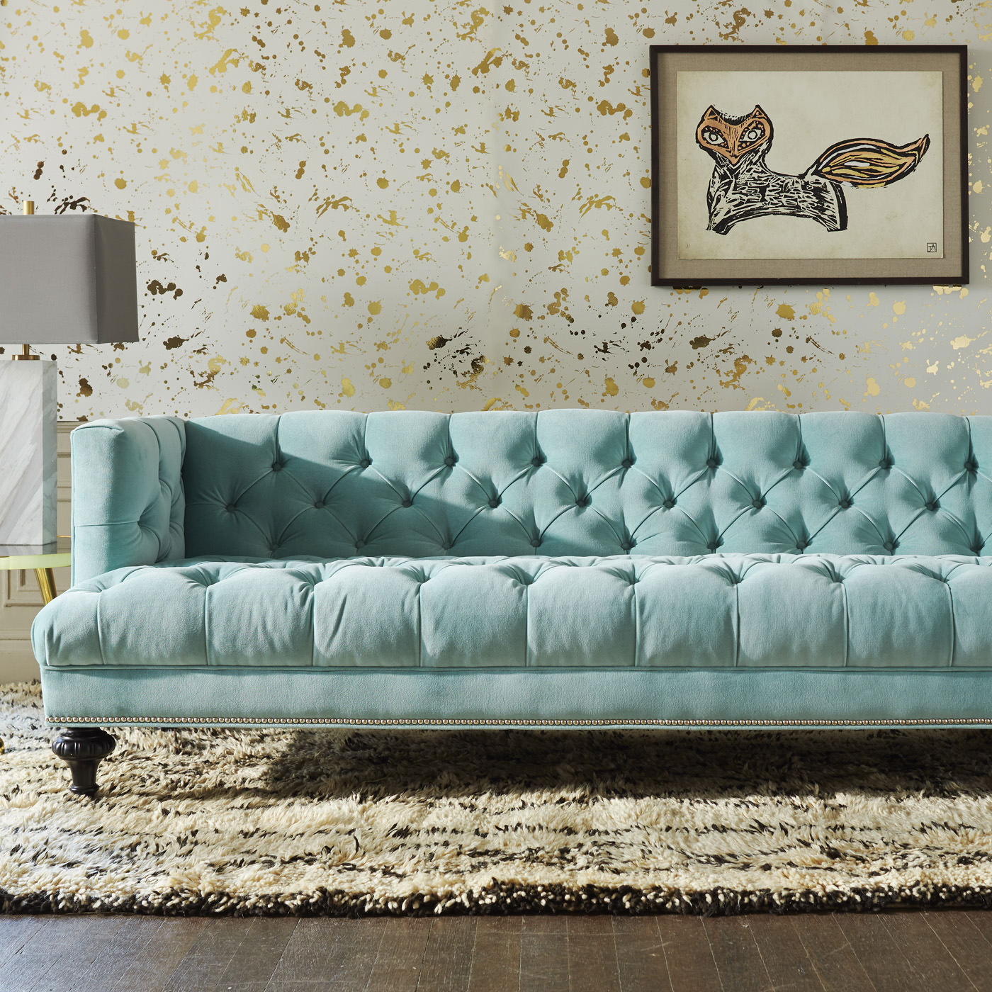
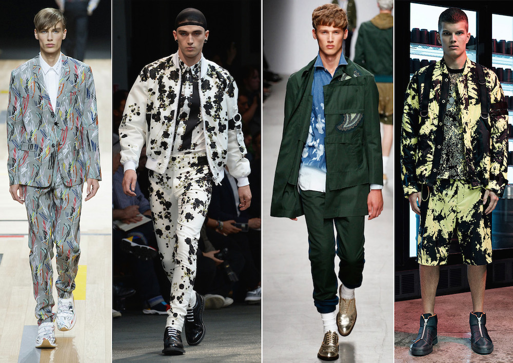
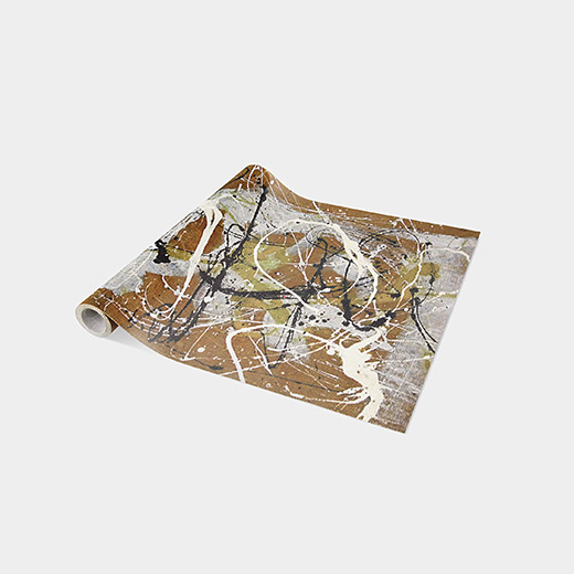
A few months ago, Beth and I popped into MoMA and of course had to stop into the museum gift store. I was so enamored by the Jackson Pollock Table Textiles—a collection of placemats and runners that feature the master painter's signature splattered look. I just knew that one day I'd have to post a blog about all the things that inspire me to take calculated risks, have fun and let loose.

Below, I've shared a video—"The Anthropologist," directed by Alistair Banks Griffin—that rethinks freestyle painting entirely. It's the work of Etsuko Ichikawa, an artist based in Seattle who uses molten glass to create freeform pyrography. Watching her work is completely entrancing. Take a look and enjoy! 

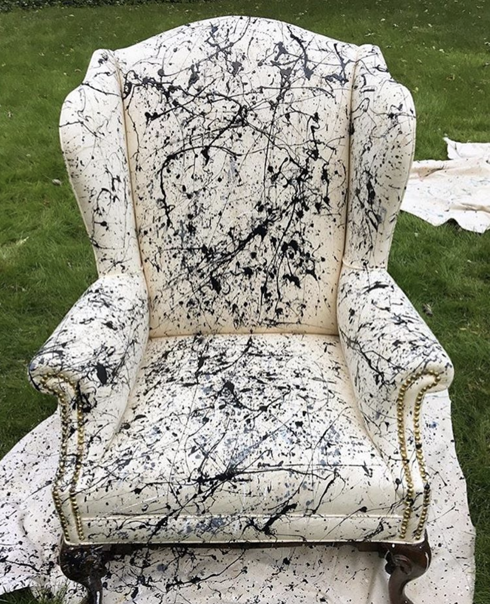
Slideshow image credits: 1/Drip Wallpaper, Jonathan Adler. 2/Yellow Brushstroke Lamp, Jana Bek. 3/The Medium Transport Tote: Splatter Paint Edition, Madewell. 4/Hinson Wallpaper, Photo by Maura McEvoy, House Beautiful. 5/Nesting Bowls, Chris Earl. 6/Hinson Wallpaper, Photo by Maura McEvoy, House Beautiful. 7/Suite One Studio. 8/Drip Wallpaper, Jonathan Adler. 9/Oyster Colored Velvet. 10/Jackson Pollock Table Textiles, Runner, MoMA. 11/Wing Chair painted by Kerry Irvine Fine Art for EKB Interiors.

{A R T} The Writing's on the Wall by Eileen Boyd

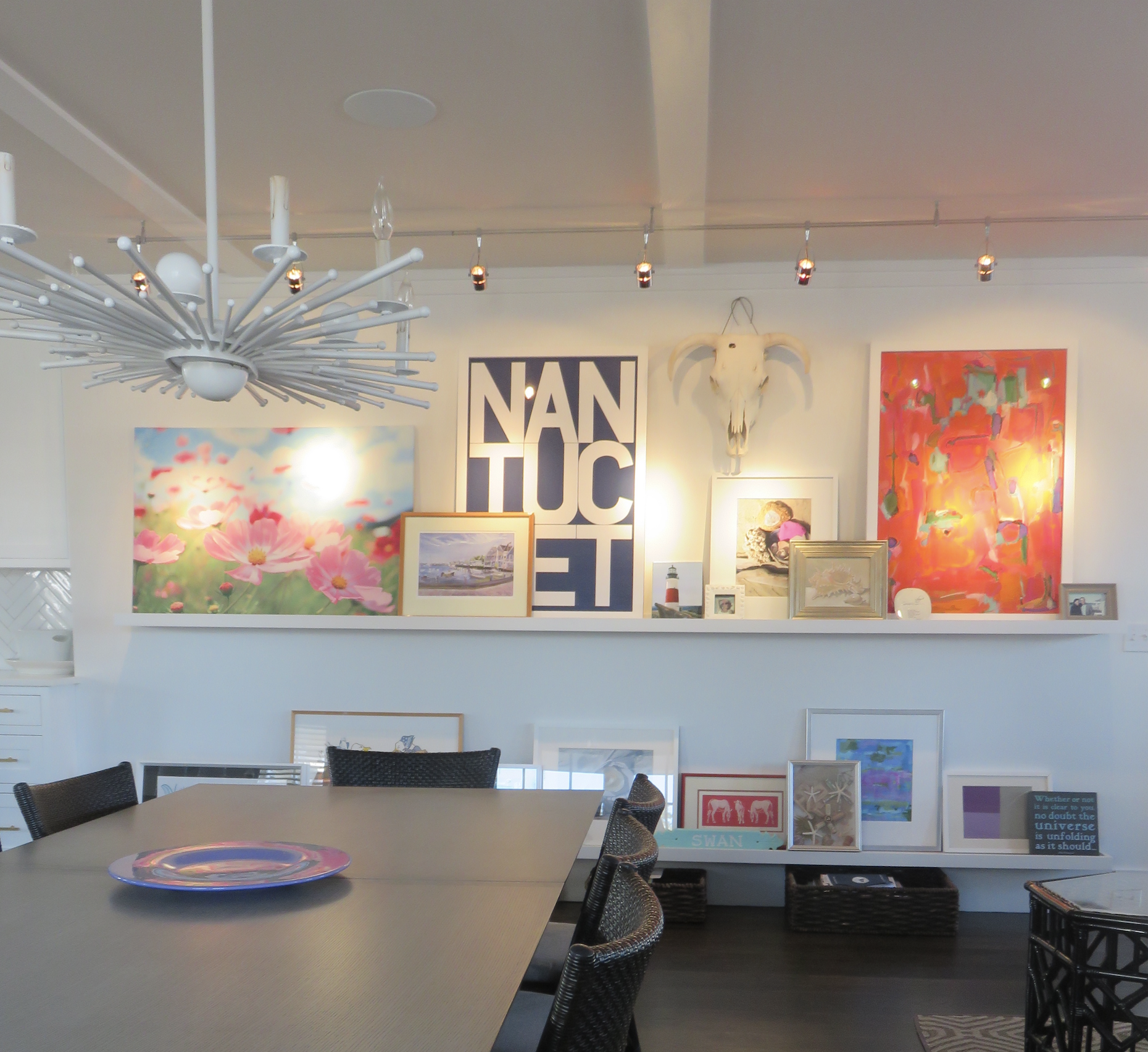
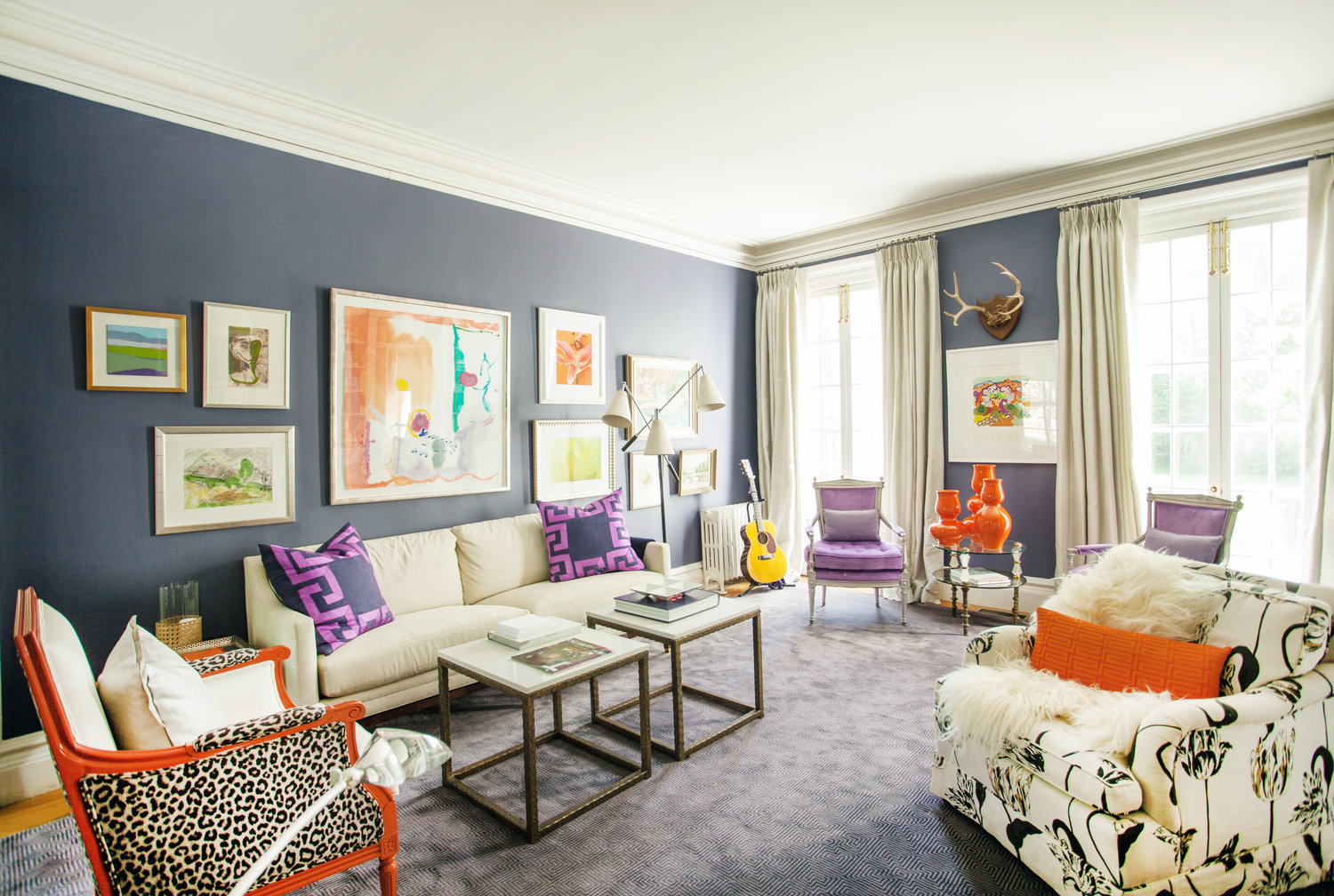
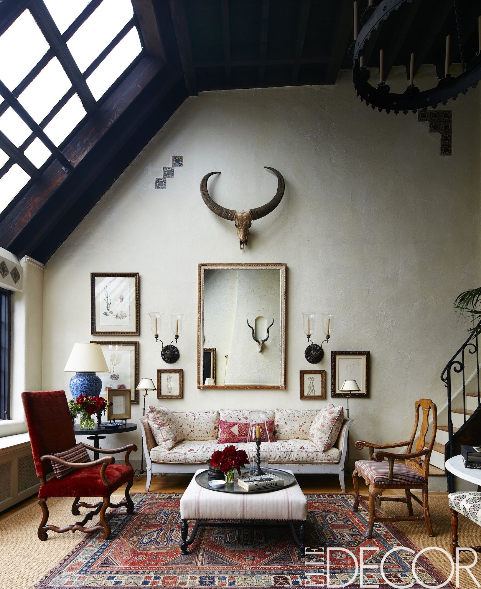
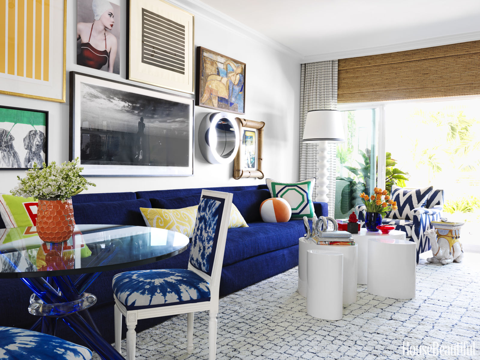
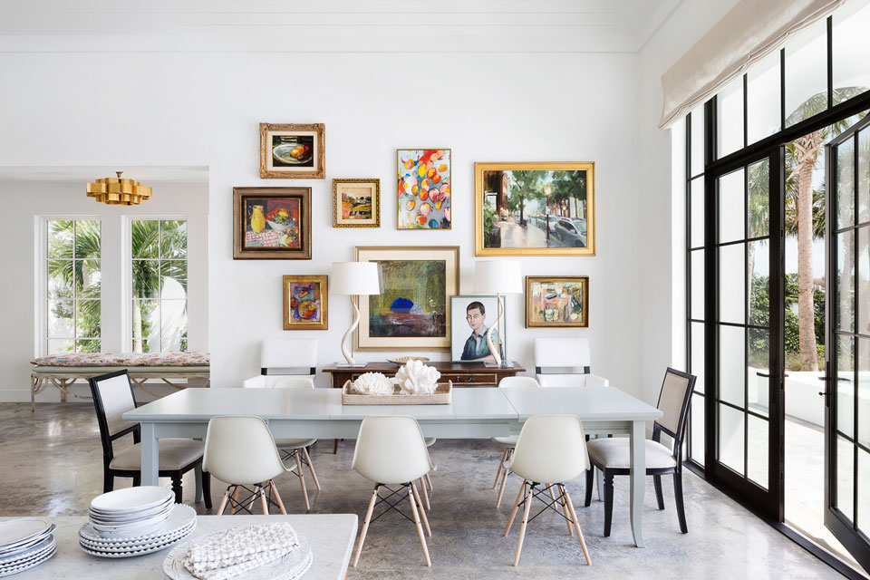
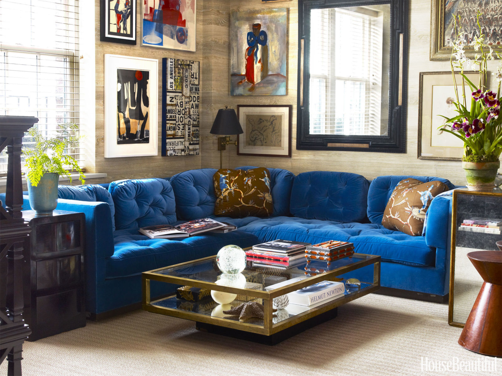
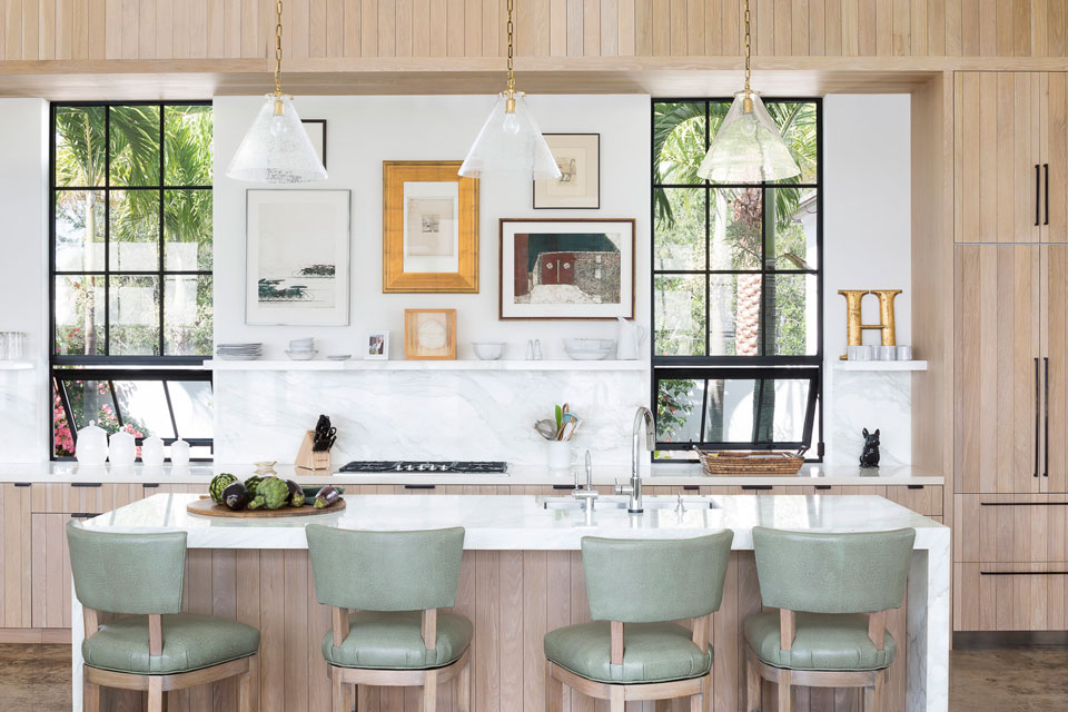
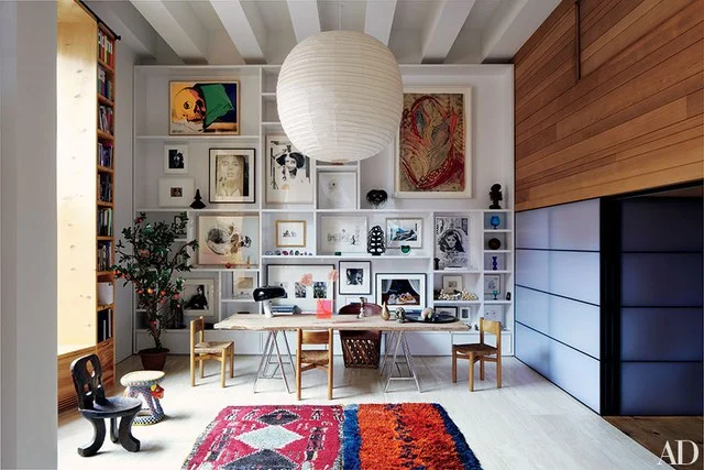
Gallery walls are like a visual puzzle that is so much fun to create. What makes them interesting is the scope of the images that you want to showcase. One recipe that I often use is a mix of different mediums, like we did in our Nantucket beach house (above): Line drawings, photography, oil paintings, sculpture, pastels, posters and collages. When I buy art, I buy it because I like it and then somehow make it fit into the tapestry of a collective. 

If you’re looking to make your own gallery wall, one common thread could be a similar color or a similar frame. Using various sizes of images make it feel more like that visual puzzle that gets worked and reworked until it fits just right. The advantage of a gallery wall is that you don’t have to commit to one arrangement; you can change your mind and shuffle the art around as you go, and that way there is no stress when putting holes in the walls. Think seasonal or have your own art show in your house! Make the artwork the pattern and color, and keep all the furniture monochromatic.

A well curated collection of an art or gallery wall can consist of art bought at a thrift shop, your child’s first painting and your great uncle’s watercolor masterpiece. The trick is having the confidence to put it all together. Here are a few of my favorite examples, starting with my very own home.

1/Patrick Cline. 2/Stephen Kent Johnson, Elle Decor. 3/Jonny Valiant, House Beautiful. 4/Jessica Klewicki Glynn. 5/Roland Bello, House Beautiful. 6/Victoria Pearson, House Beautiful. 7/Jessica Klewicki Glynn. 8/Simon Watson, Architectural Digest. 9/Simon Watson, Architectural Digest.

{I N S P I R E D} Nocturnal Animals: Fashion Meets Film Meets Interior Design by Eileen Boyd

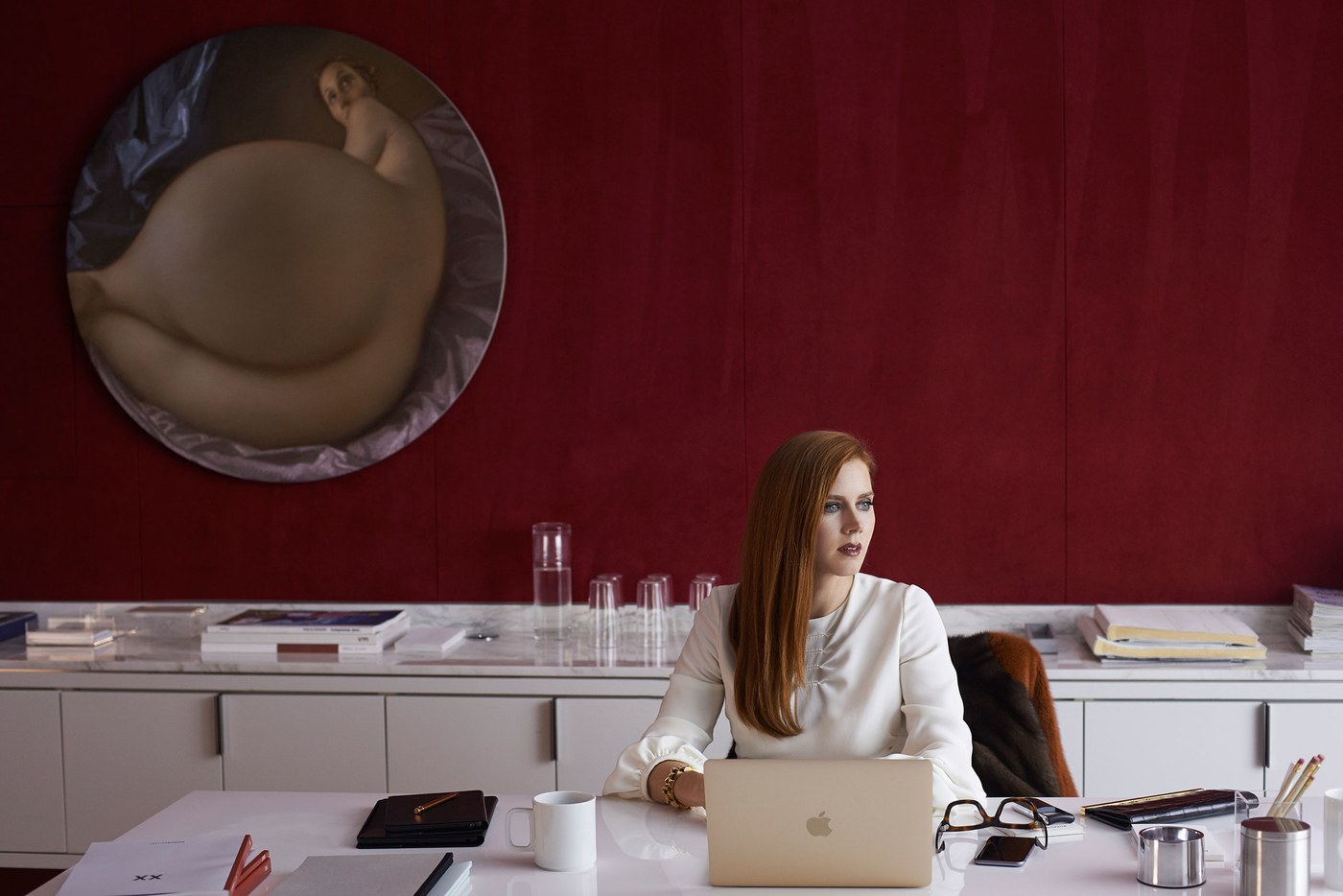
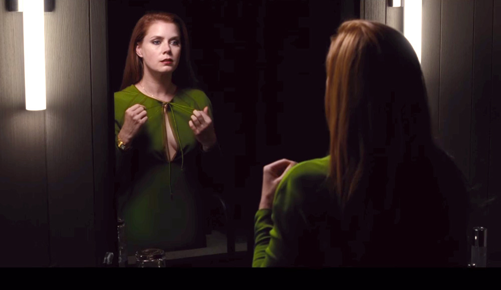
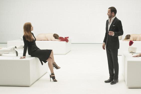
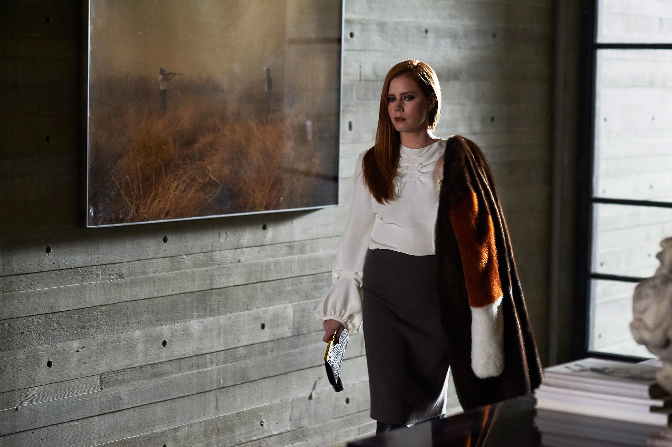
Photography by Merrick Morton/Focus Features

With Paris Design Week just recently in our rear view, I'm thinking back fondly on my time studying in Paris alongside my studio-mate Tom Ford. I'm so happy for him and his film Nocturnal Animals. (If you haven't seen it yet, you really must!) 

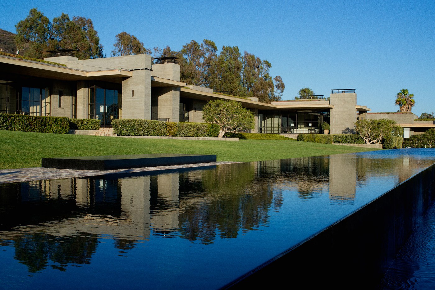
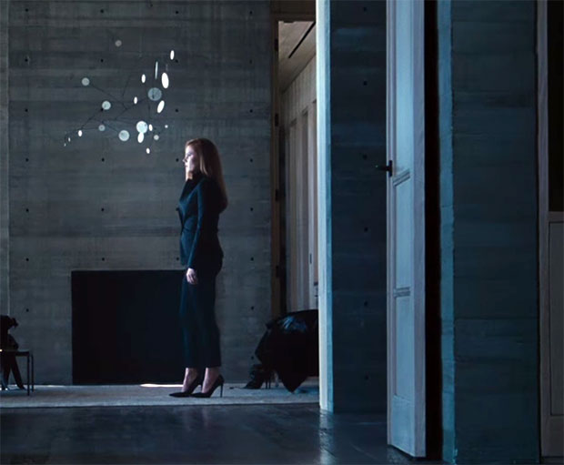
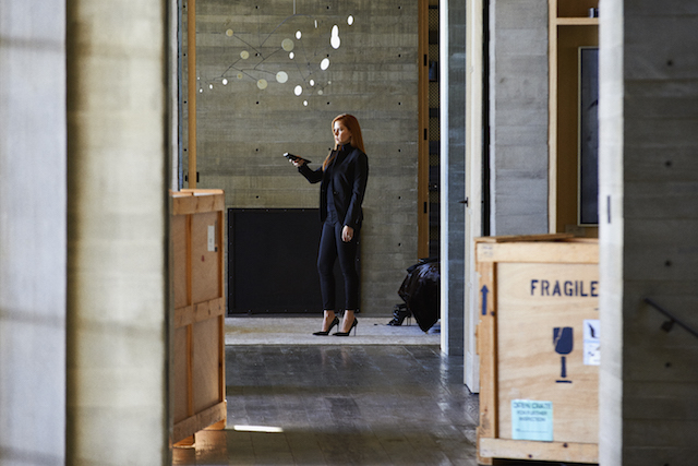
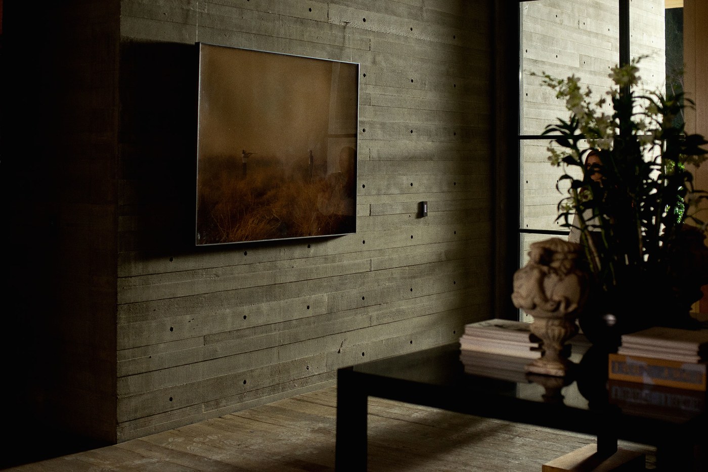
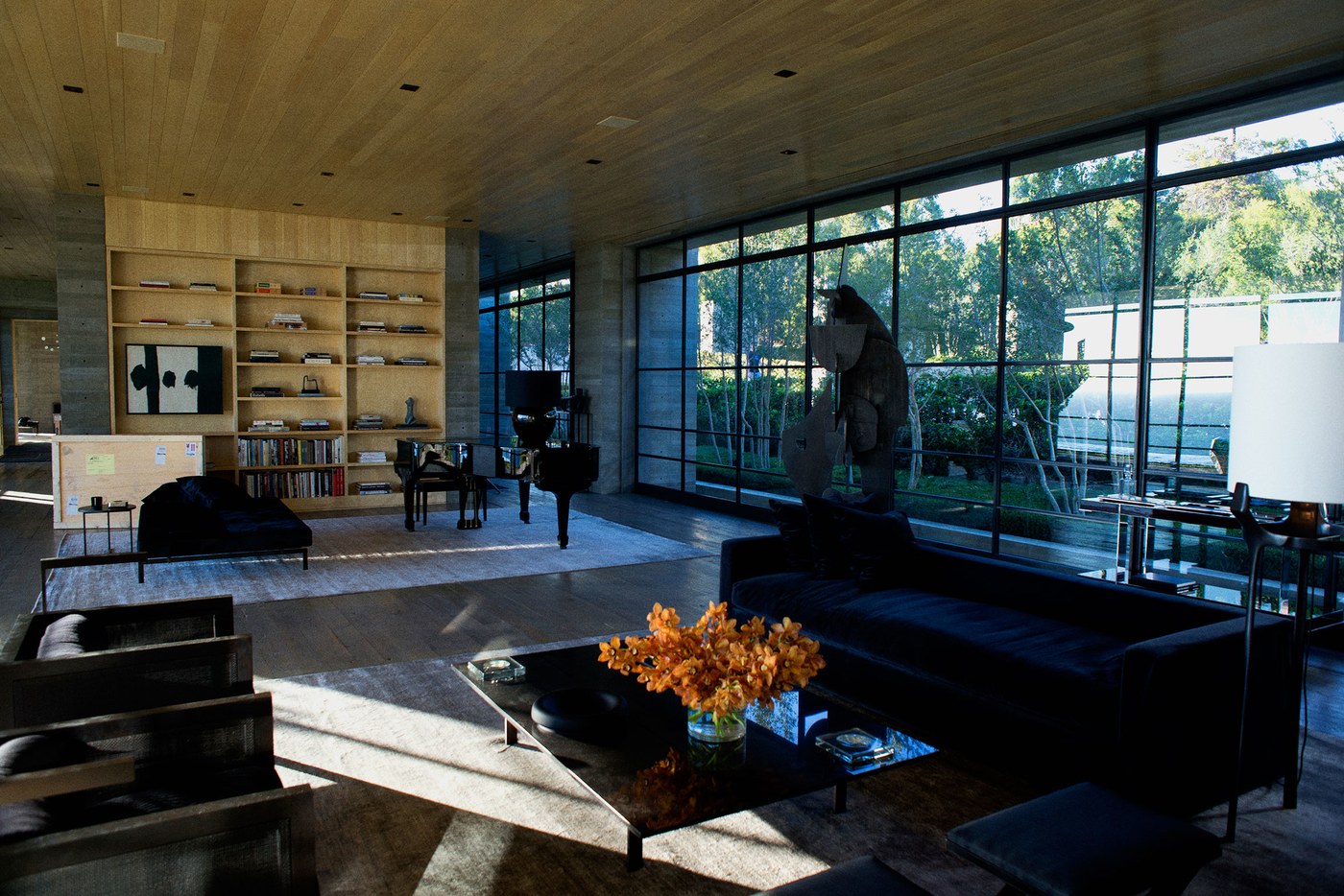
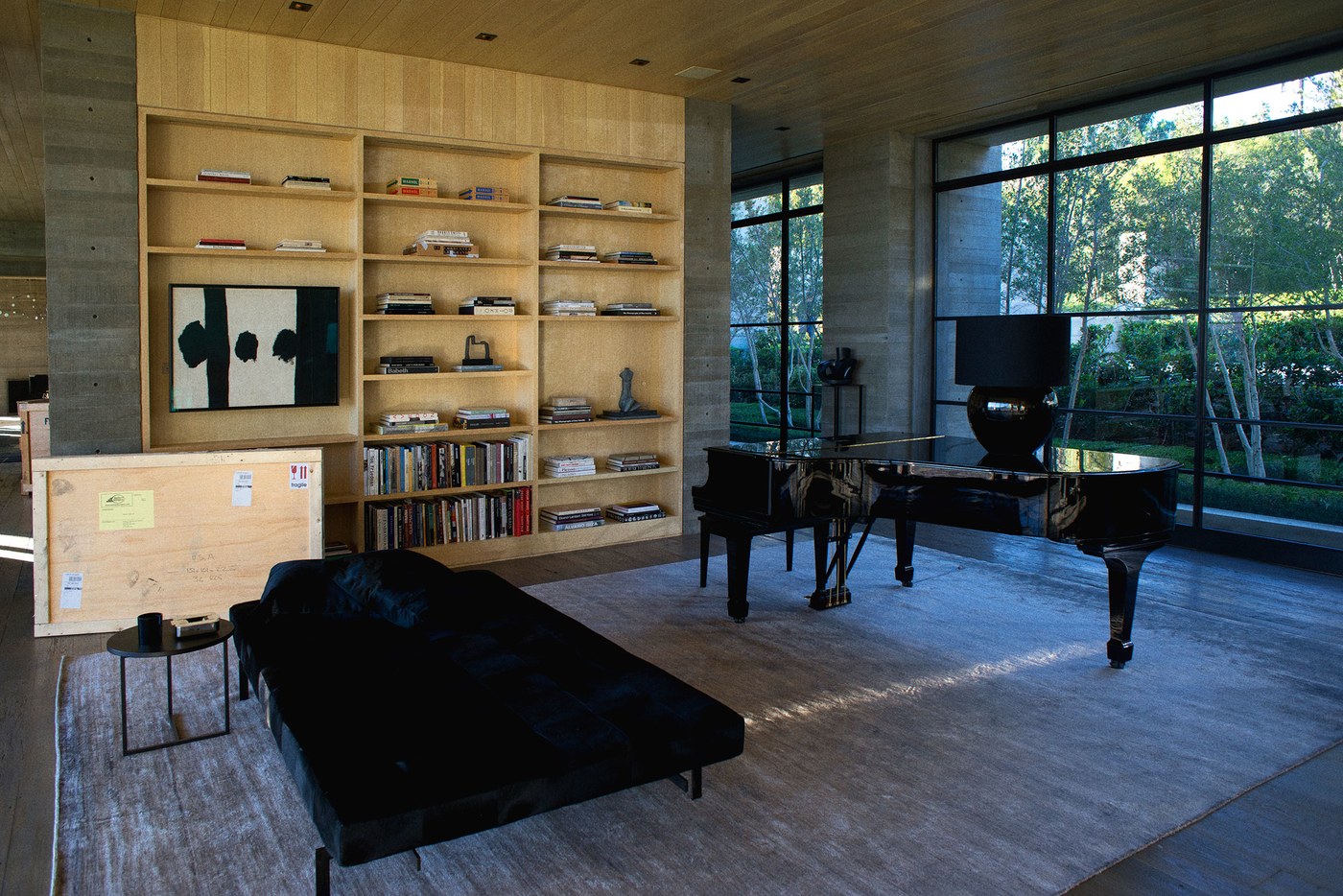
The film itself is truly a work of art, from the writing and storytelling to the directing to the cinematography and especially the acting. But it's important to note a main character aside from the ones played by Amy Adams, Jake Gyllenhaal and Michael Shannon. And that is the interior design. Shane Valentino reworked the interiors of a Scott Mitchell-designed house to include art, furnishings and materials that are as fashion-minded as Tom himself but austere enough to underscore the emotional, hauntingly beautiful storyline.     

{H O R I Z O N} I Have This Thing For Side Tables by Eileen Boyd

Fendi's collaboration with Italian designer Cristina Celestino for THE HAPPY ROOM, which debuted at this past Design Miami/ still has me smiling. It also has me saying... "Wow! Those tables!" I honestly can't wait to spec these babies for one of my clients. (Notice how they are shaped to mimic a stud earring...brilliant!) I've always felt that accent tables were a great opportunity to be playful and witty in a space—adding that perfect touch of whimsy. Here's a peek at a few other side tables I'm crushing on these days, including the tops of these stunners...

{H O R I Z O N} Kinetic Energy: Mobiles + Pendants by Eileen Boyd

                                                                      &nbs…

                                                                           Image via Hotchkiss Mobiles     

I have always been attracted to kinetic sculptures—to their movement, their energy, their artistic nature. I fell in love with the art of Joel Hotchkiss after buying one of his mobiles from the Guggenheim Store in NYC. After researching more of his work, calling him and getting to know him on the phone, he made several custom pieces for me. I then had him make eight pink sculptures for a Pink Aid fundraiser two years ago, and they were a huge hit. Today, I still love his work just as much, if not more, and I’m happy to say I can now call him a friend.

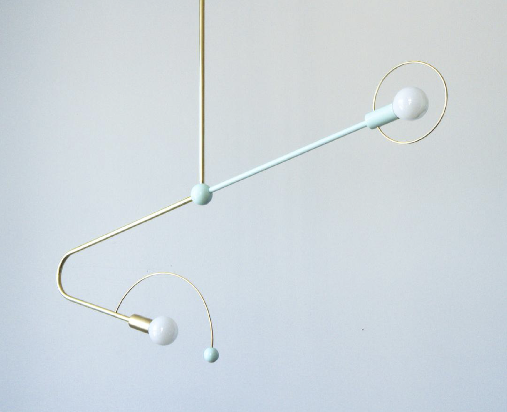
Here are a few swoon-worthy light fixtures whose grace and sculptural quality remind me of mobiles.

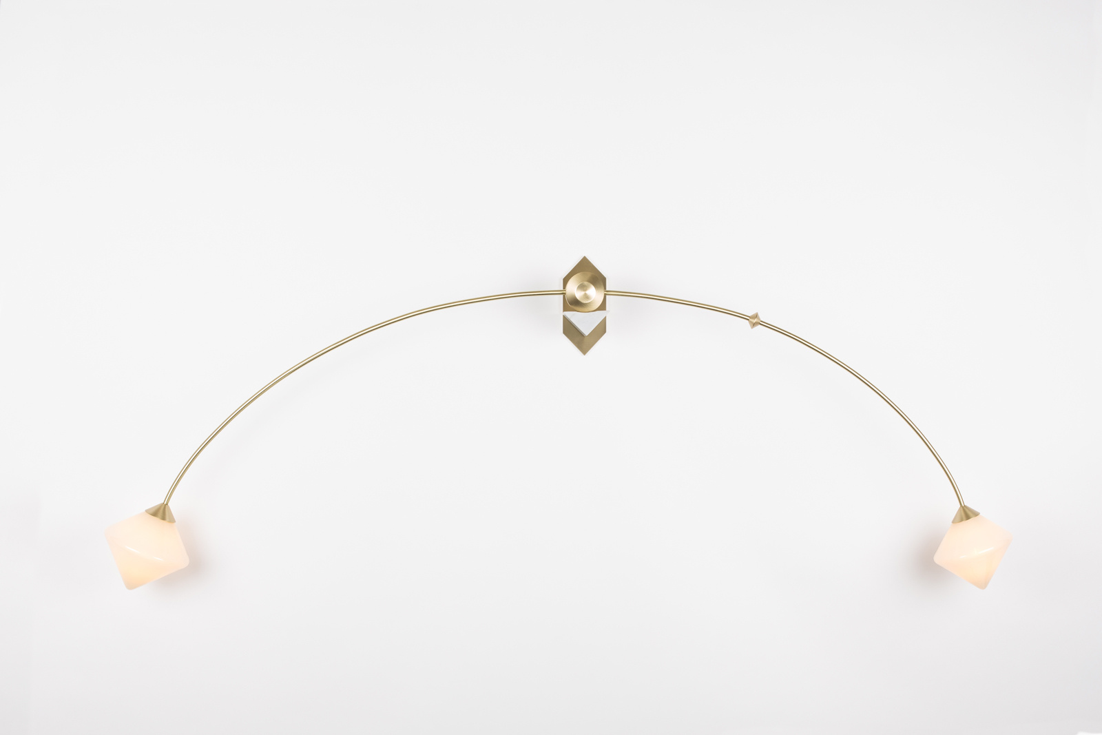
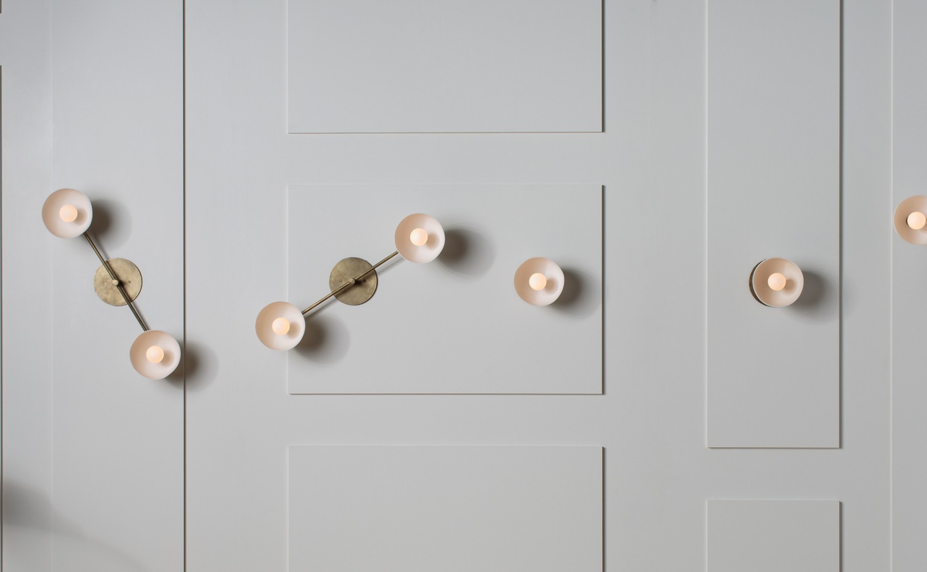
1. I love everything Bec Brittain does, but her Themis 68 sconce in brushed brass with white marble and ivory glass is extra special, and the arch gives it that mobile-like movement. Image via

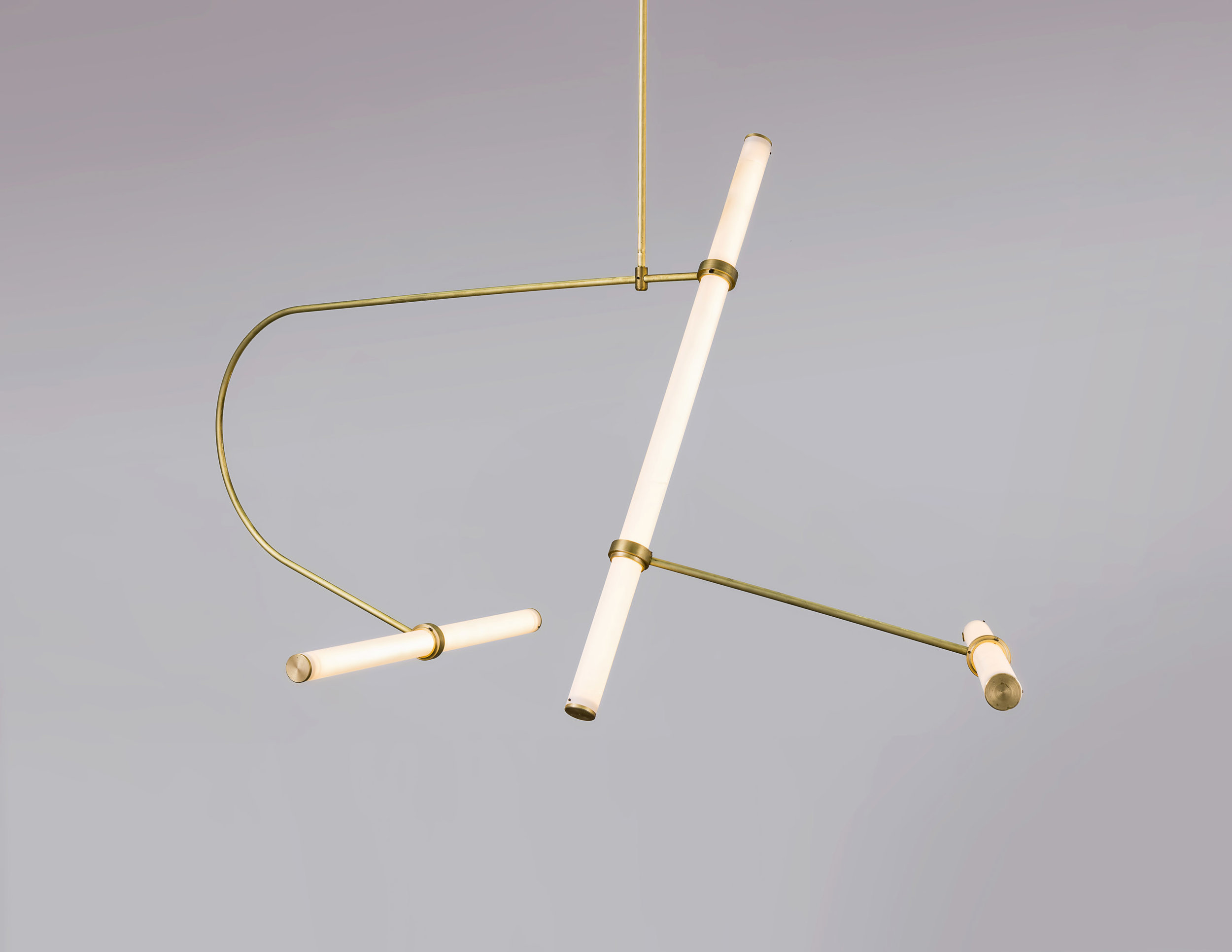
2. Talk about kinetic energy. Naama Hofman's Tube Pendant Collection has so much flexibility, with brass arms and LED-lit acrylic tubes that can be reconfigured into different arrangements. Image by Uri Grun via

3. The OTTO Double fixture from David Weeks Studio might be a bit more linear than the traditional mobile, but the delicateness and arc in its form still conjure the same visions. Image via 

4. Örsjö gives the best description of its Decostick pendant: "a modern chandelier flirting with the 1930s." JV Arkitekter designed the fixture as part of a renovation of the Hotel Riviera Strand in Båstad, Sweden. It allows for different strengths of luminosity to emit from the spheres verses the spotlight, so there's movement even in the light itself. Image via 

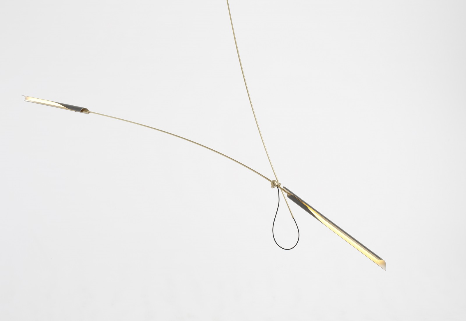
5. Jean-Pascal Gauthier. An instant favorite when I discovered his sculptural, mobile-like lights. They're minimalist and avant-garde at the same time, and the inspiration he draws from Calder is clear. Image via

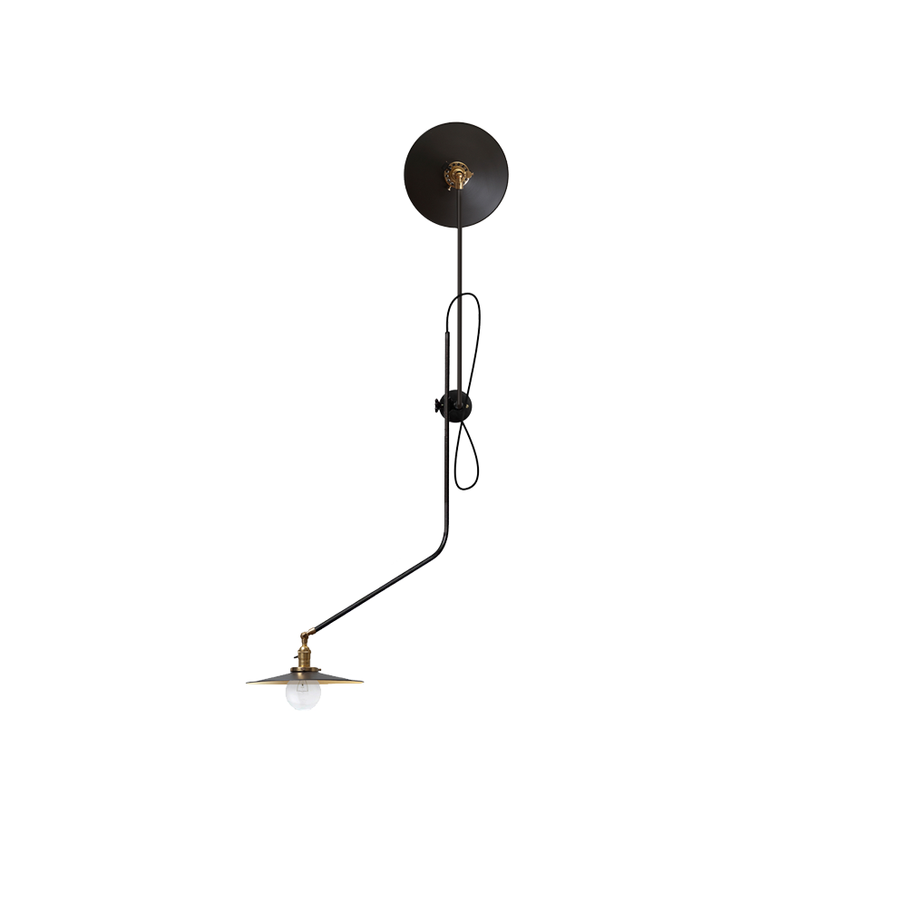
6. Workstead certainly knows how to create a light fixture as an art piece. Its Bent Wall Lamp is the perfect example. The composition of steel, cast iron and brass keep it industrial and debonair. Image via

7. No mobile-esque post would be complete without including Apparatus. These Trapeze lights are inspired by the dynamics of a circus act, and their seriously fun demeanor comes across especially in Trapeze 1 & 2. Image via

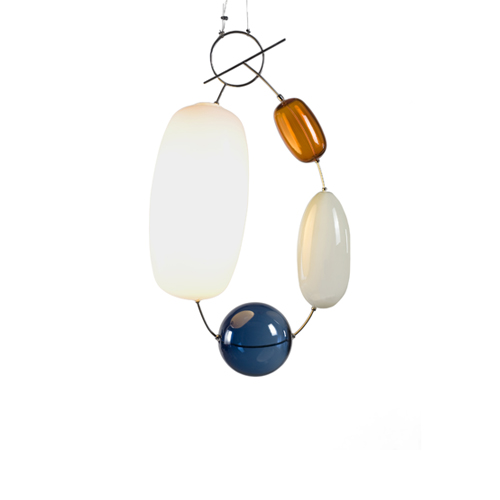
8. And finally, the Hely light by Katriina Nuutinen for Klong, made of colored glass, stainless steel, plastic and LEDs. It looks like a piece of jewelry more than anything else, but the shapely form brings me back to the geometry of a mobile structure suspended in midair. Image via

{I N S P I R E} Come On Baby Light My Fire by Eileen Boyd

the english room_berdini-damson-rug-by-designers-guild-image-by-designers-guild.jpg

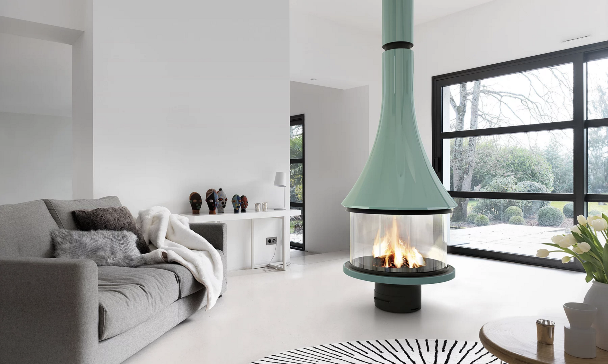
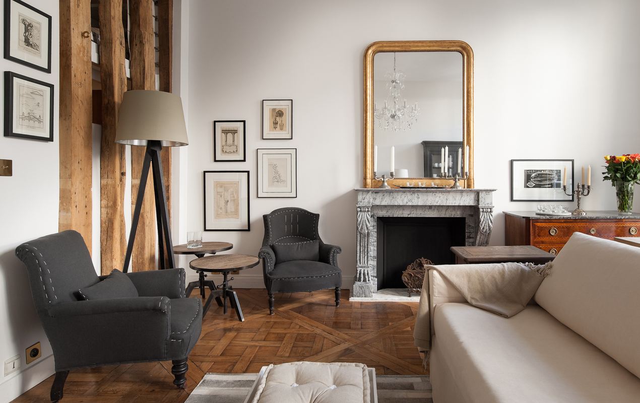
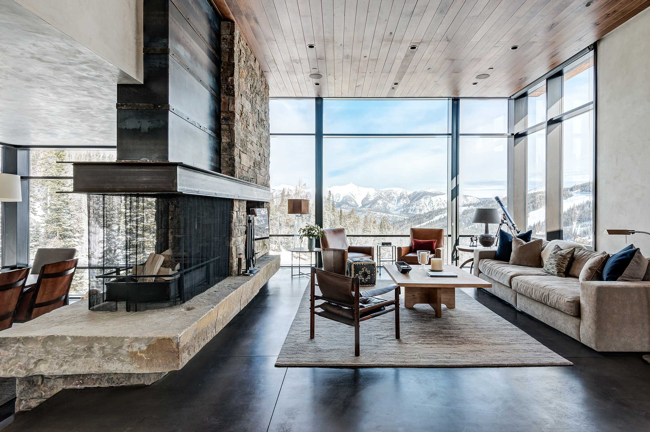
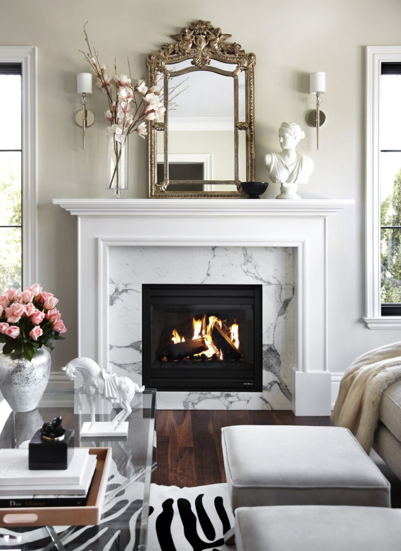
I'm very affected by seasons, and one of my favorite things about winter in New York is coming in from the cold and cozying up to a roaring fireplace with a good book and a cup of hot cocoa. From the always colorful and luxurious Designers Guild to the masterful masonry of Lew French and a modern chalet by Pearson Design Group, just looking at these beauties helps to cure some of this frost bite!
1/2/3/4/5/6/7

{F A S H I O N} Mish New York: Experiential Jewelry by Eileen Boyd

Image credit: Mish New York

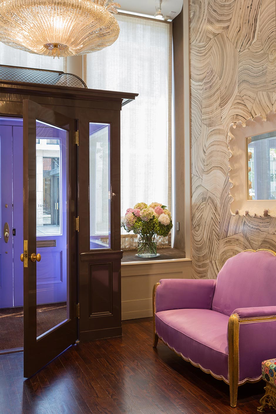
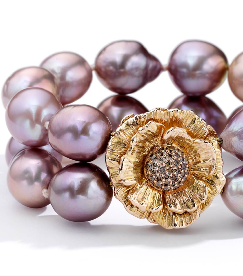
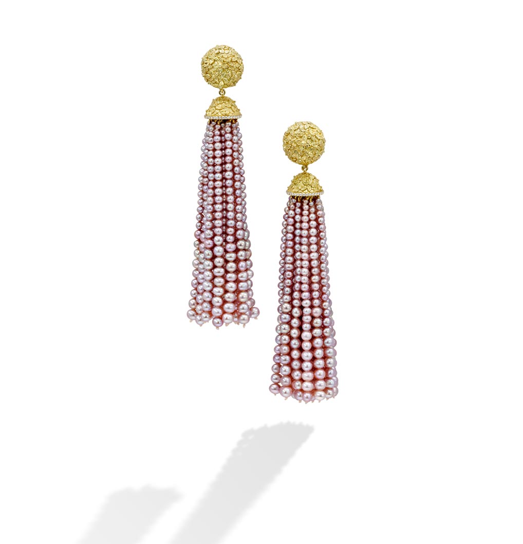
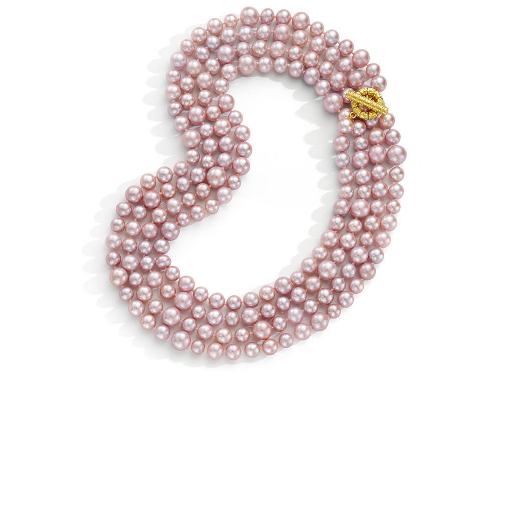
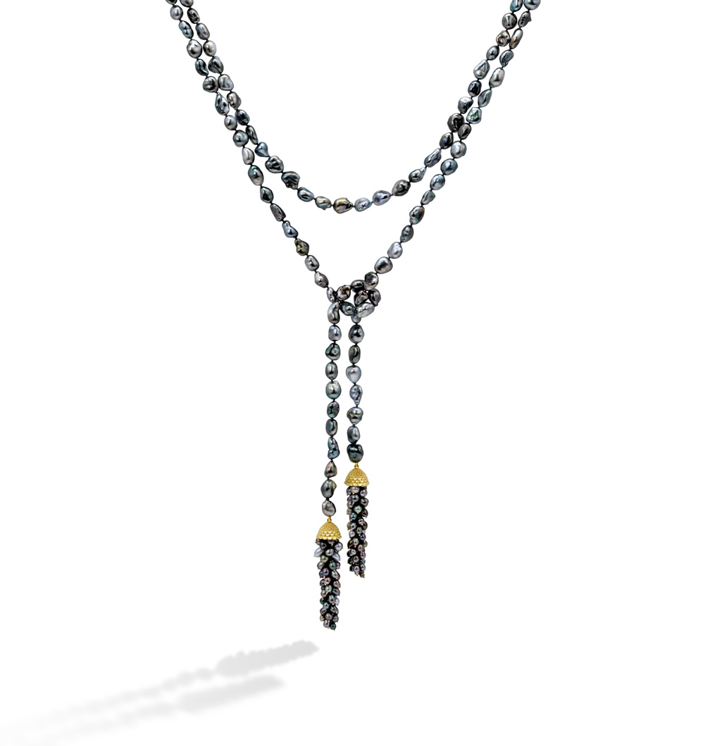
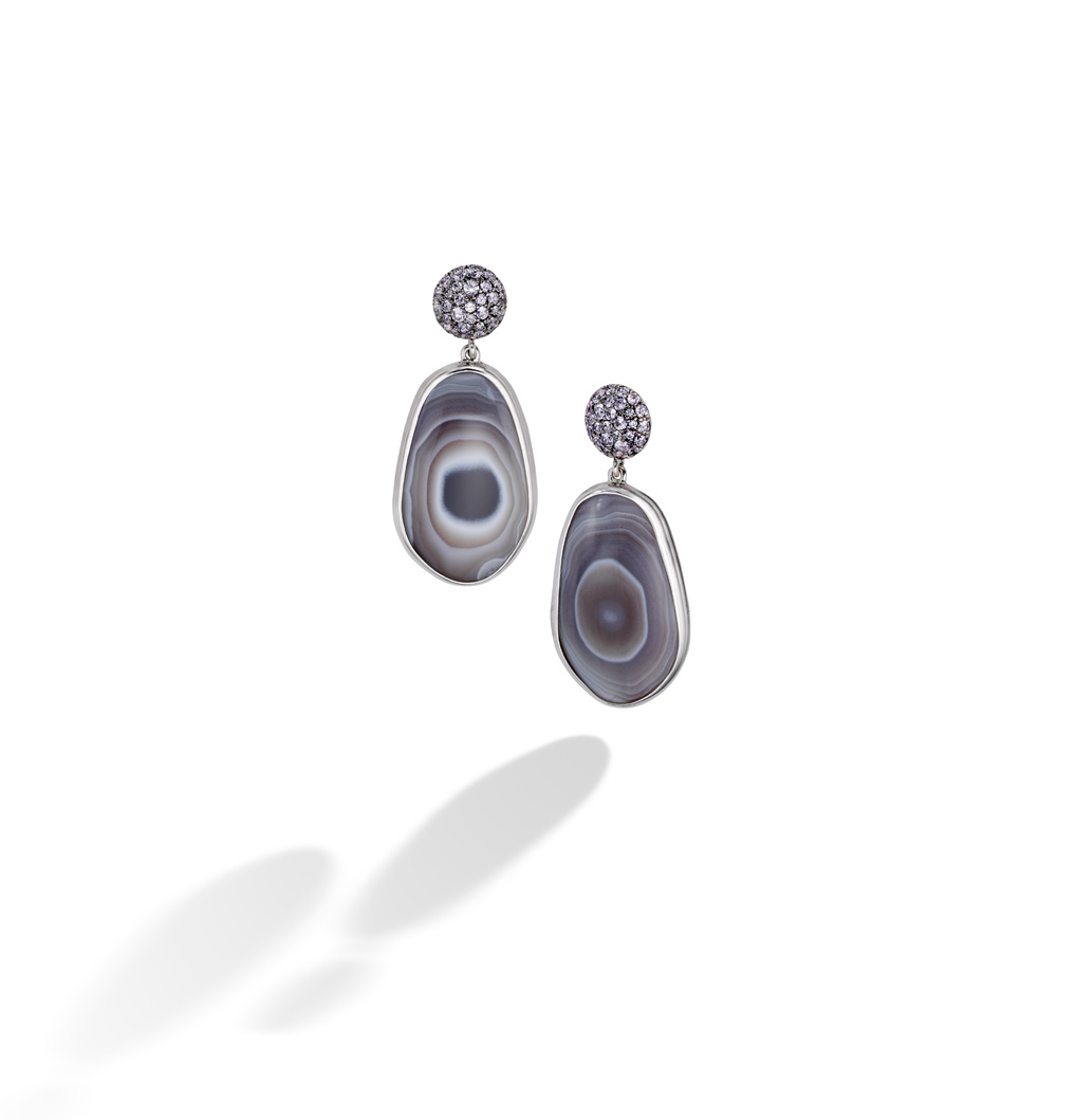
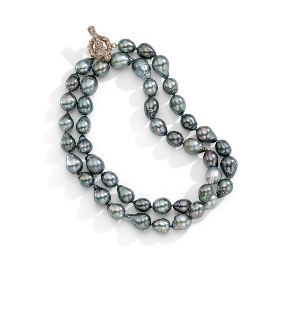
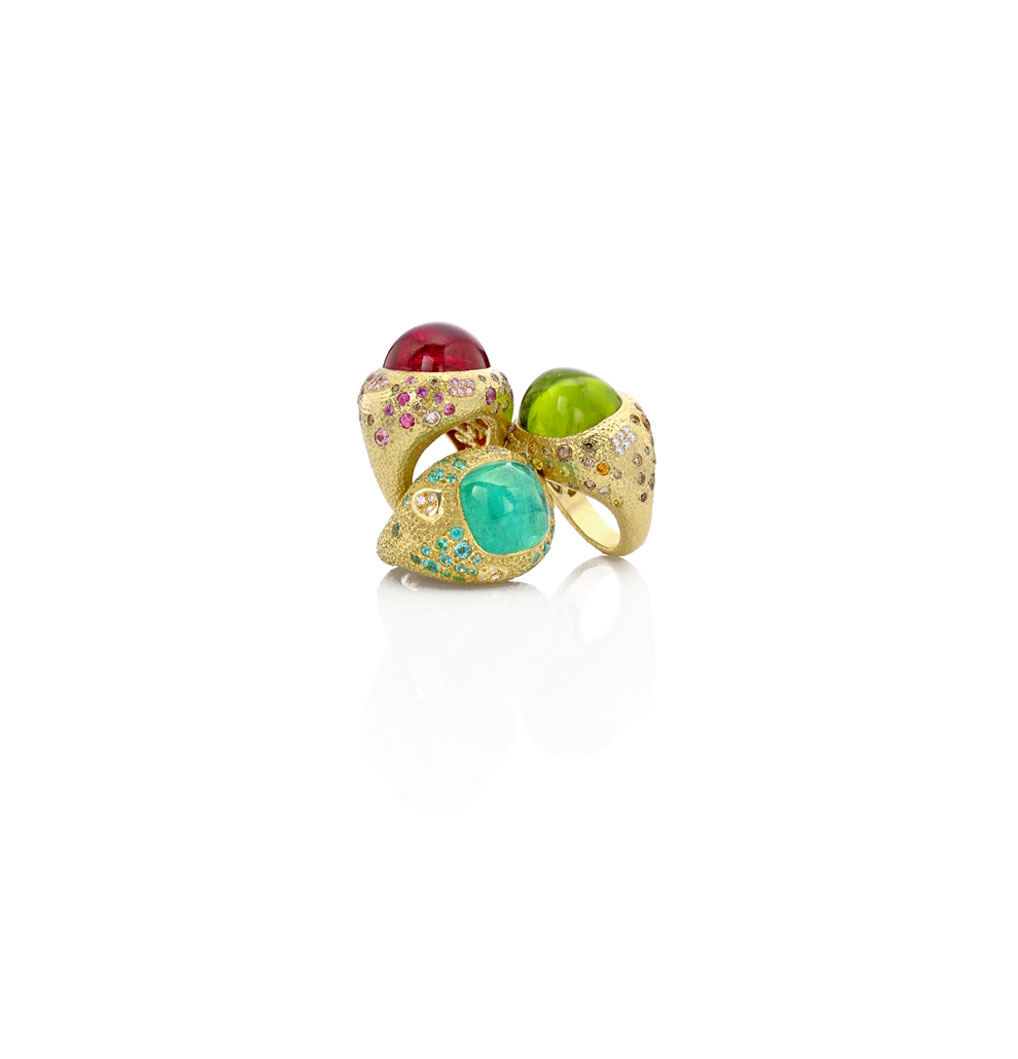
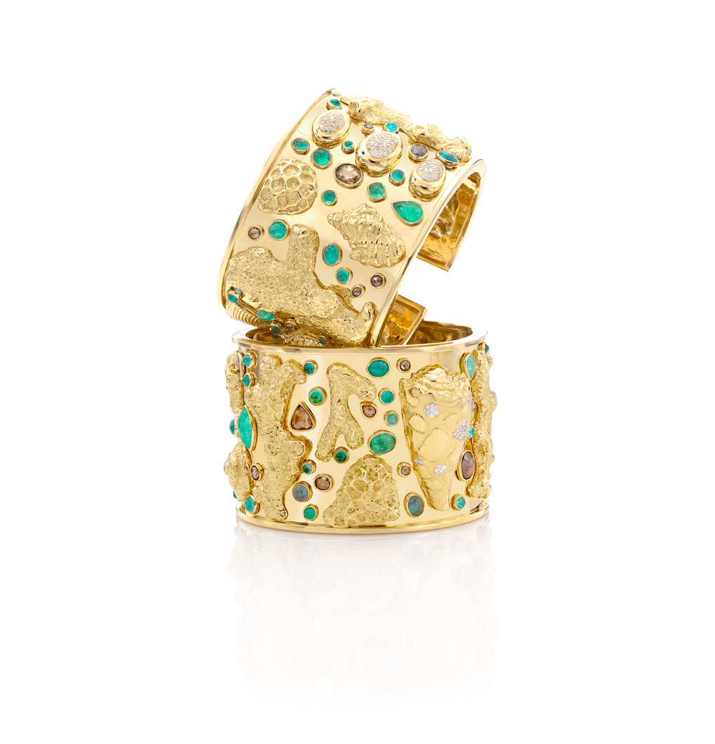
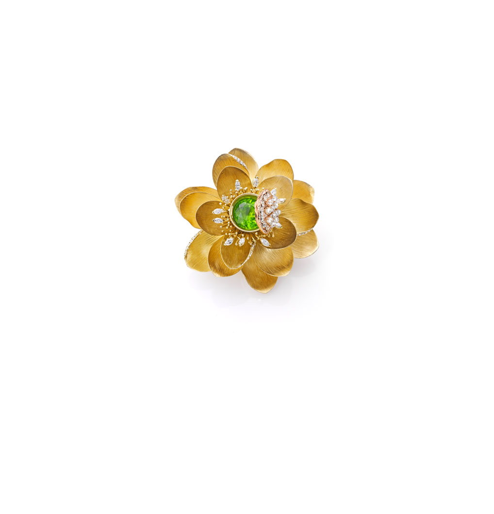
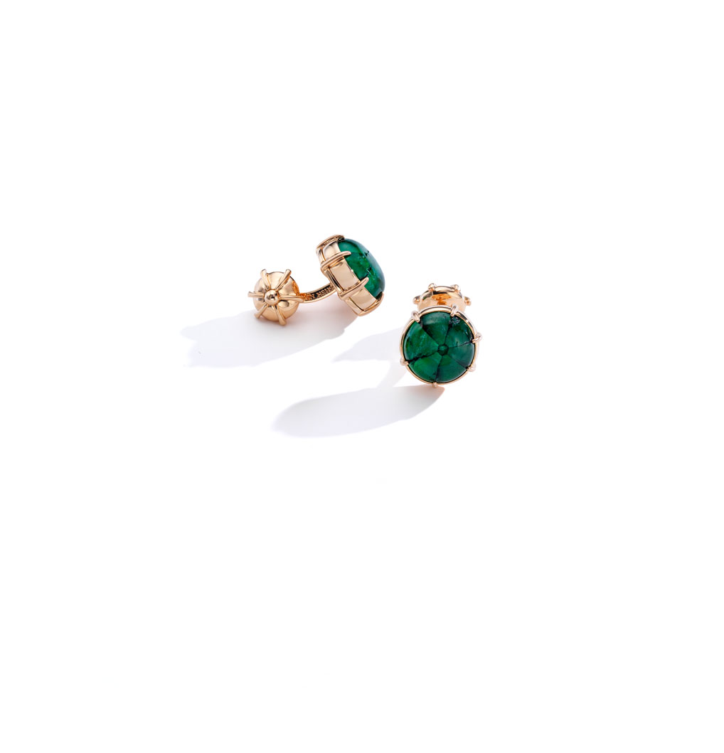
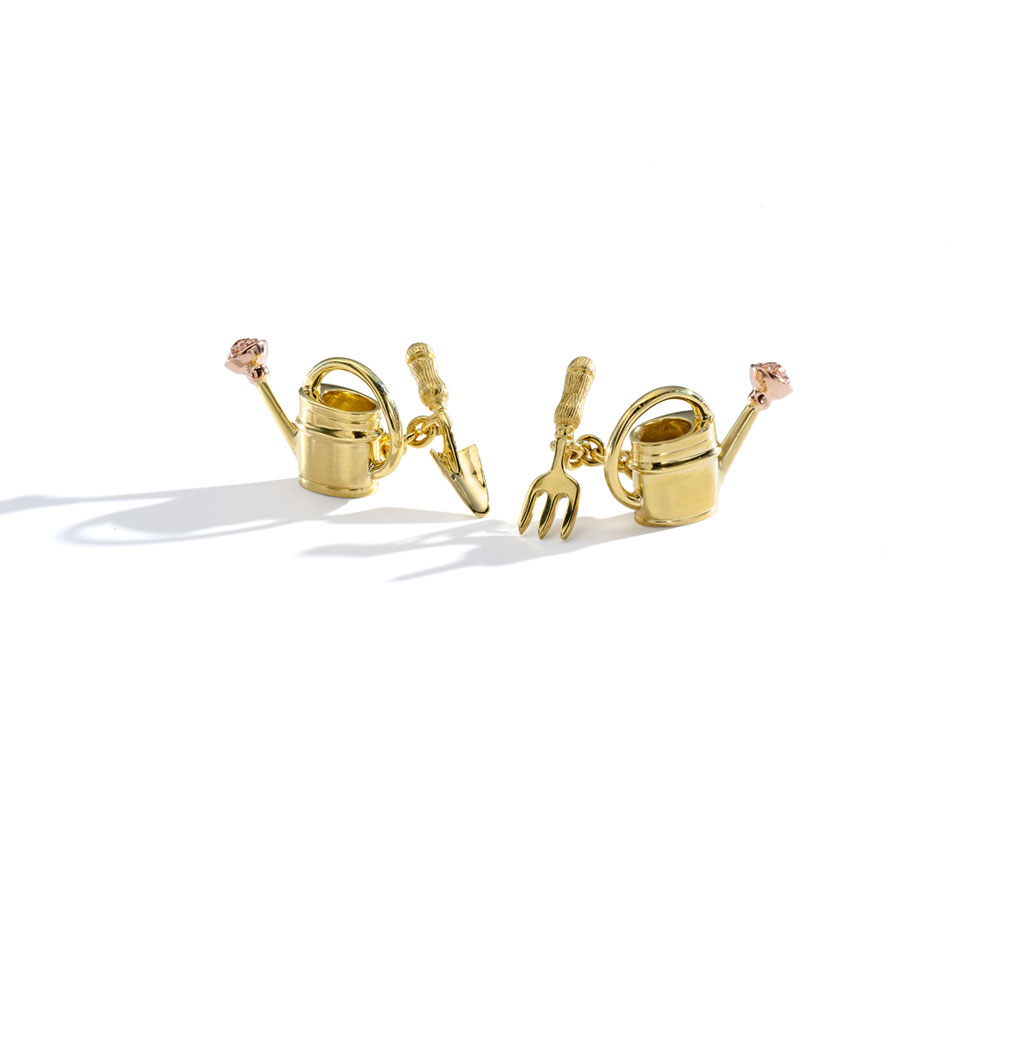
Walking into Mish's 30 Bond Street studio in NYC isn't like shopping for jewelry at just any jewelry boutique. It's an unforgettable experience that speaks to all of the senses. Beth and I paid a visit to Mish a few weeks ago on a trip into the city—the purple door and green facade called to us immediately of course. (With the fashionable charm and historic architecture outside, you'd think you were on Bond Street in London.) Once we stepped inside, the feast for the eyes continued, from the hand-painted malachite mural, to the upholstered walls with nailhead trim, to the jewels themselves, all on display like pieces in a museum. Made with South Sea pearls and precious stones, Mish Tworkowski's fancy and whimsical baubles, bracelets, brooches and more will stop you in your tracks. See for yourself!

1/ Poppy Clasp Pink Pearl | 2/ Hydrangea Tassel Earrings | 3/ Pink Pearl Necklace | 4/ Rivergod Willow Pearl Necklace | 5/ Hanalei Stud Drop Earrings | 6/ Honeywood | 7/ Ratu Rings | 8/ Wakaya Cuffs | 9/ Lotus Brooch | 10/ Trapiche Cufflinks | 11/ Watering Can Cufflinks